
Complete coaching brands, built to grow.
Identity, website, LinkedIn and content designed as one system, so every touchpoint earns trust and turns attention into booked calls.
180+ pieces of work for 45+ coaches
Logos and branding that earn trust at first glance.
Hand-sketched, nature-inspired logos and brand systems, built as long-term assets for coaching businesses.
180+ pieces of work for 45+ coaches
Coaching websites that turn visitors into calls.
Clear messaging, real proof and an effortless path to booking. Explore the live sites we designed and built for coaches.
180+ pieces of work for 45+ coaches
LinkedIn profile optimization that brings in clients.
Banners, headlines, About sections and Featured cards that turn a profile into a landing page and make the right people reach out.
180+ pieces of work for 45+ coaches
Promotional graphics that stop the scroll.
Carousels, promotional posts and covers in each coach's visual style, recognised in the feed before anyone reads the name.
180+ pieces of work for 45+ coaches
Lead magnets that turn expertise into leads.
Lead magnets and e-books designed to share a coach's thinking, grow the email list and start more conversations.
180+ pieces of work for 45+ coaches
Quick, eye-catching edits that grow your audience.
Podcast and reel edits for coaches: captioned, on-brand clips from podcasts, talks and recordings, cut for attention and built to turn viewers into clients.
180+ pieces of work for 45+ coaches
Complete coaching brand growth
Clients we built the whole brand for: identity, website, LinkedIn and content working together.
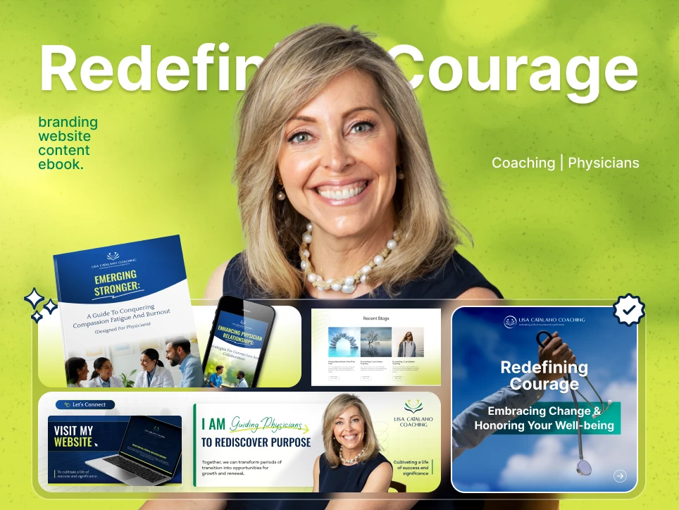
Lisa Catalano Coaching
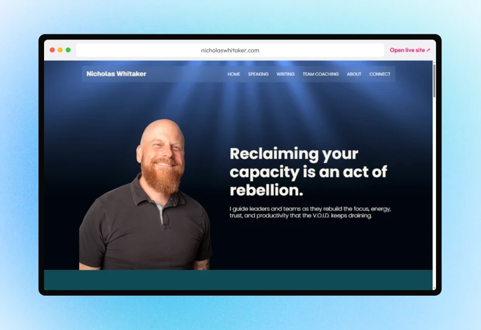
Nicholas Whitaker Coaching & Rebellion Collective
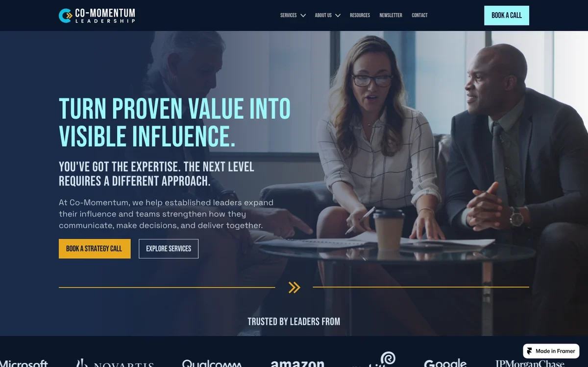
Co-Momentum Leadership
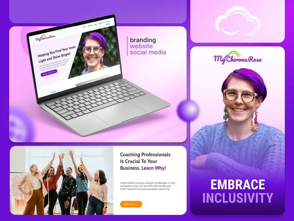
MyChironaRose
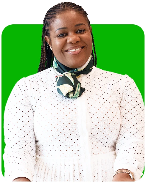
Eat Clean
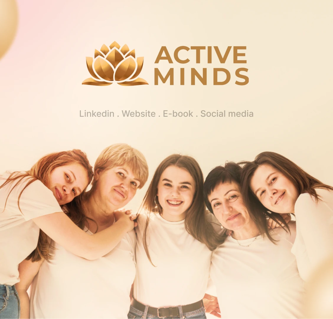
Active Minds
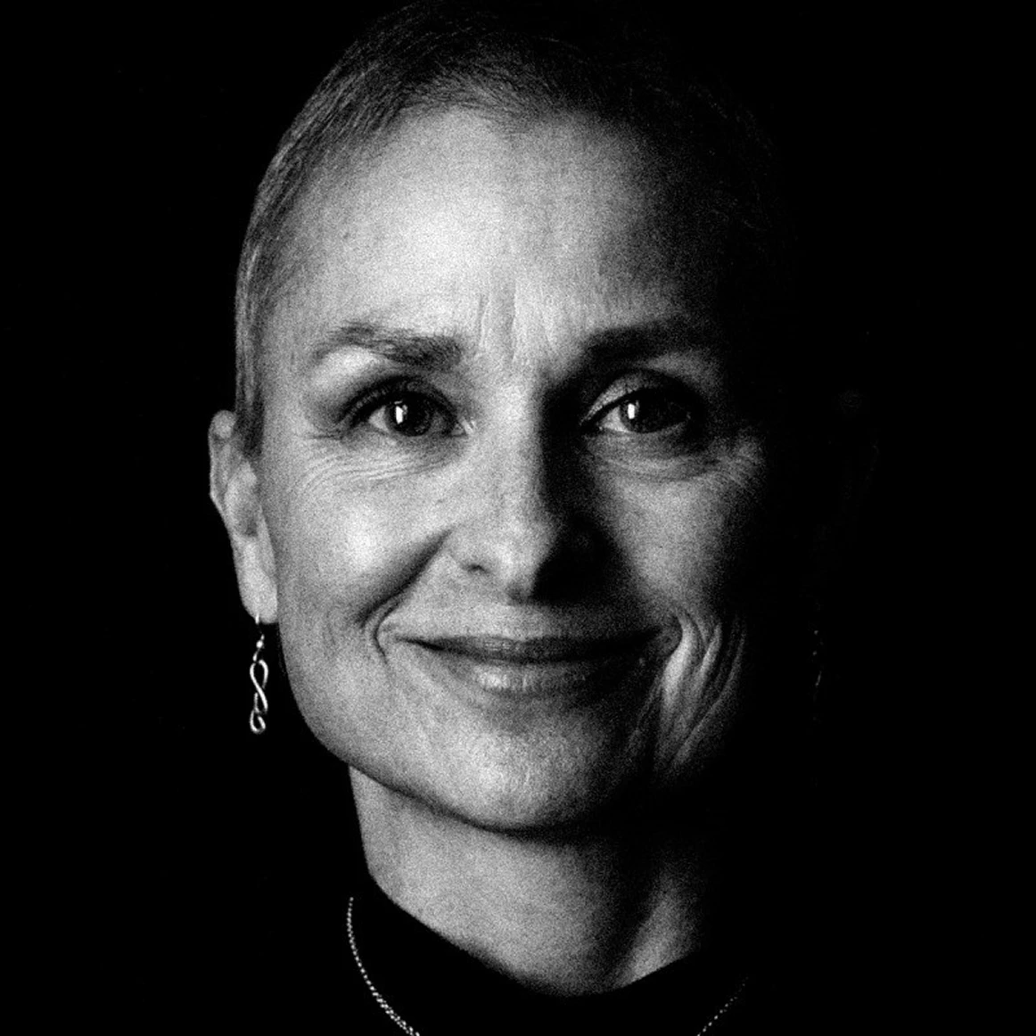
Swopelight
Logo & Branding
Logo & branding projects, from first hand sketches to complete brand guides.
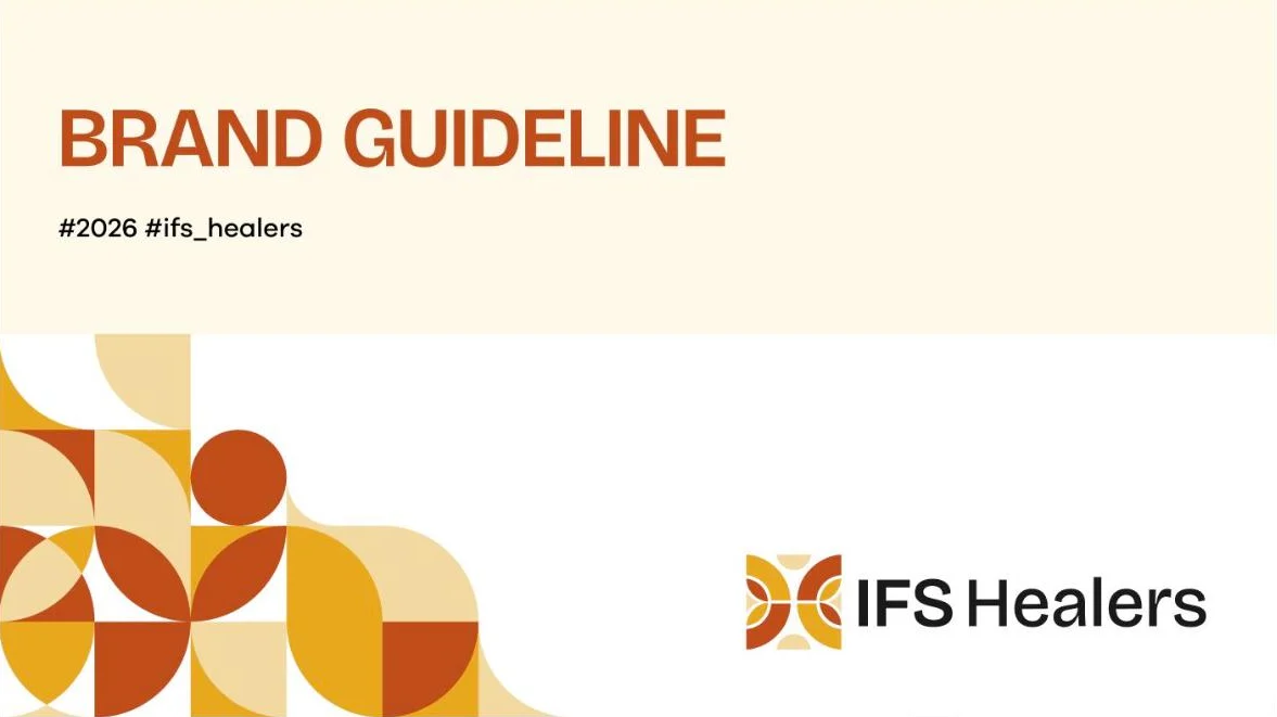
IFS Healers
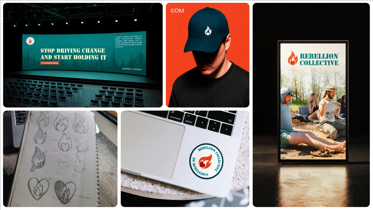
Nicholas Whitaker Coaching & Rebellion Collective
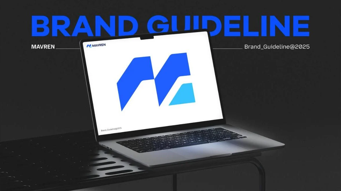
Mavren
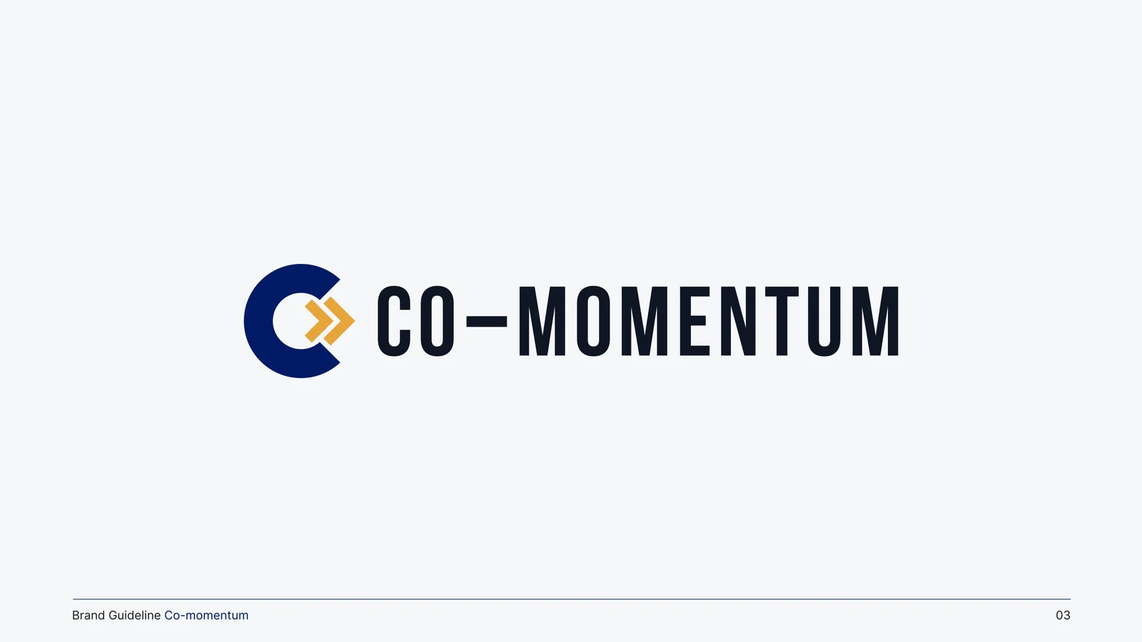
Co-Momentum Leadership
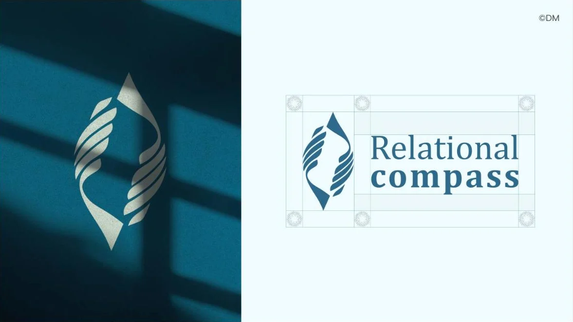
Relational Compass
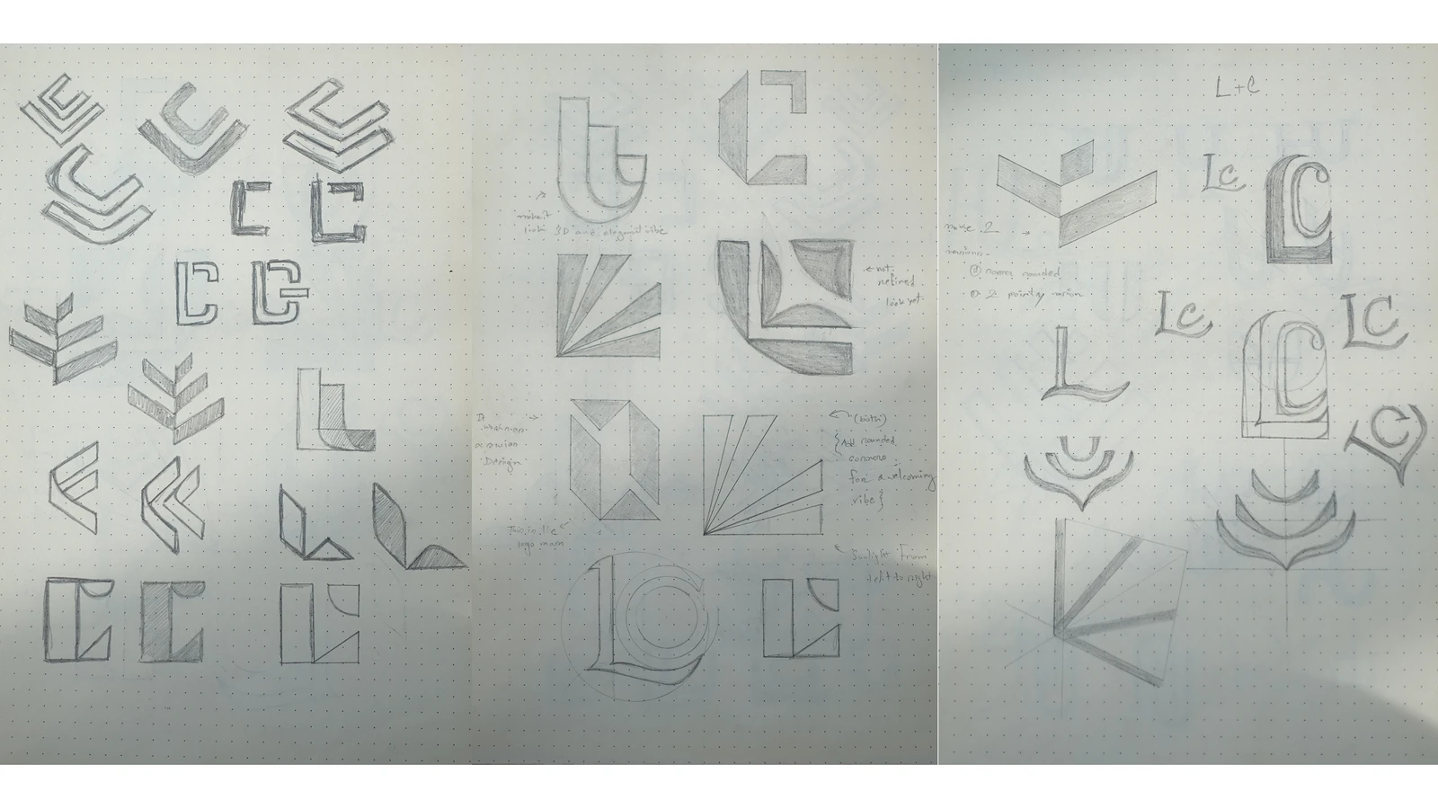
Lisa Catalano Coaching
Breaking Braces
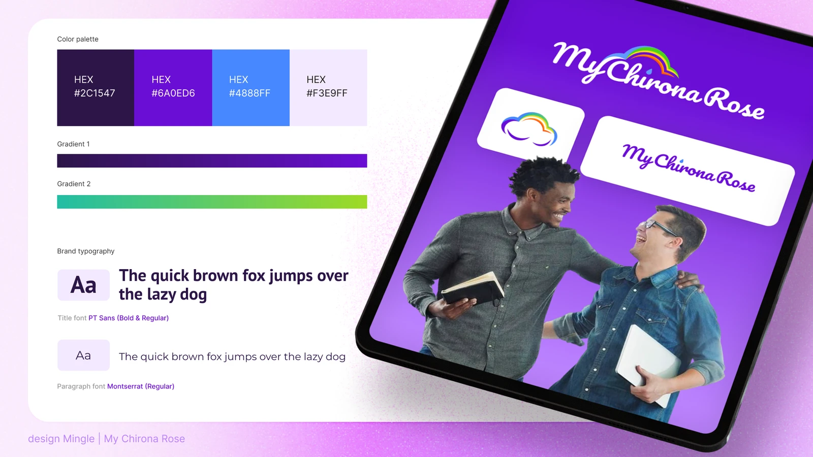
MyChironaRose
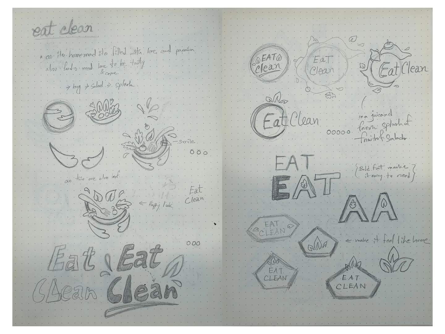
Eat Clean
Coaching websites
Coaching websites designed to explain the offer clearly and turn visitors into booked calls.
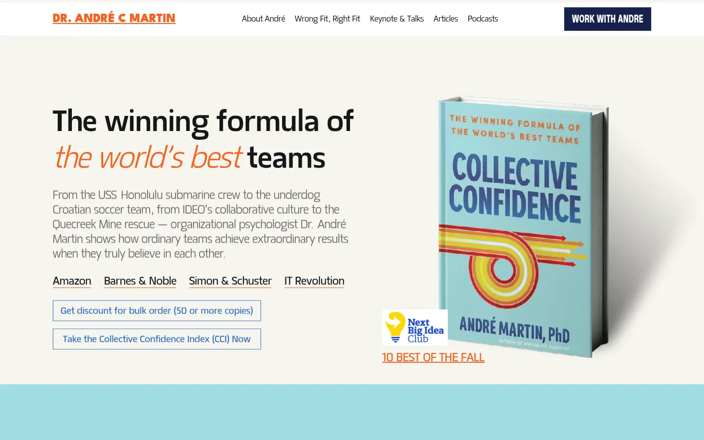
TeamAnd
Nicholas Whitaker Coaching & Rebellion Collective
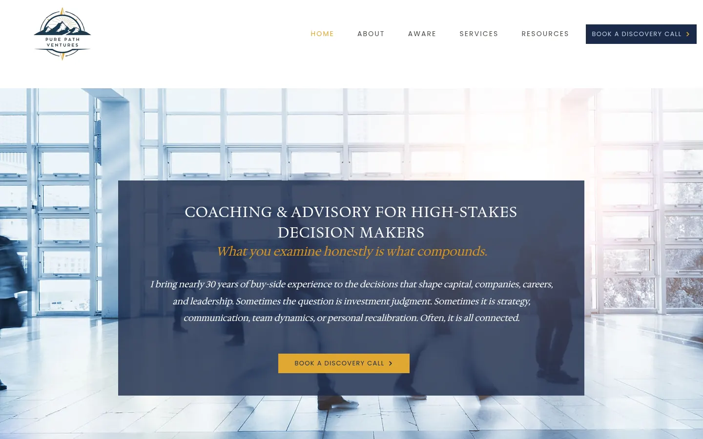
Pure Path Ventures
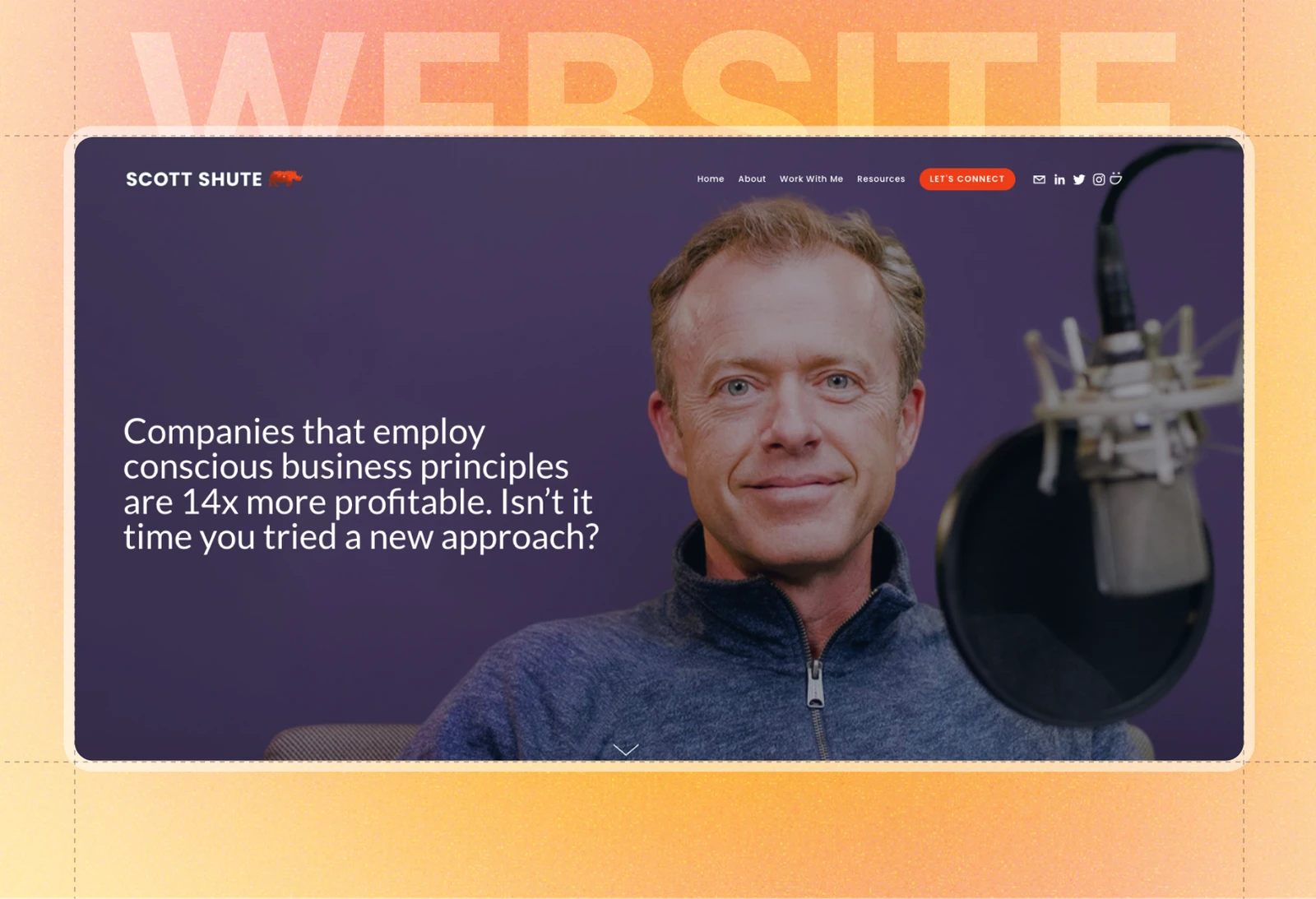
Scott Shute
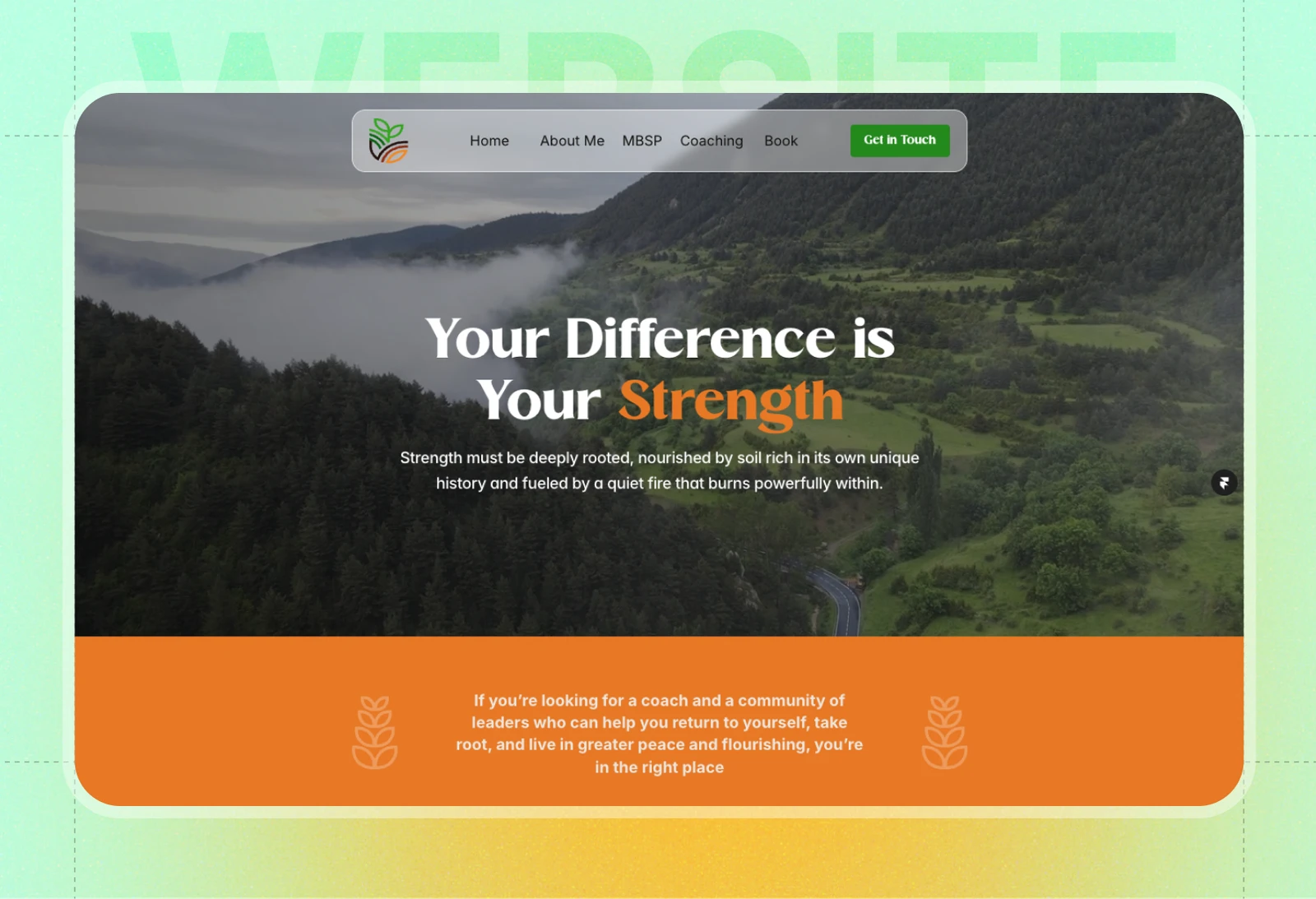
Wainwright Yu
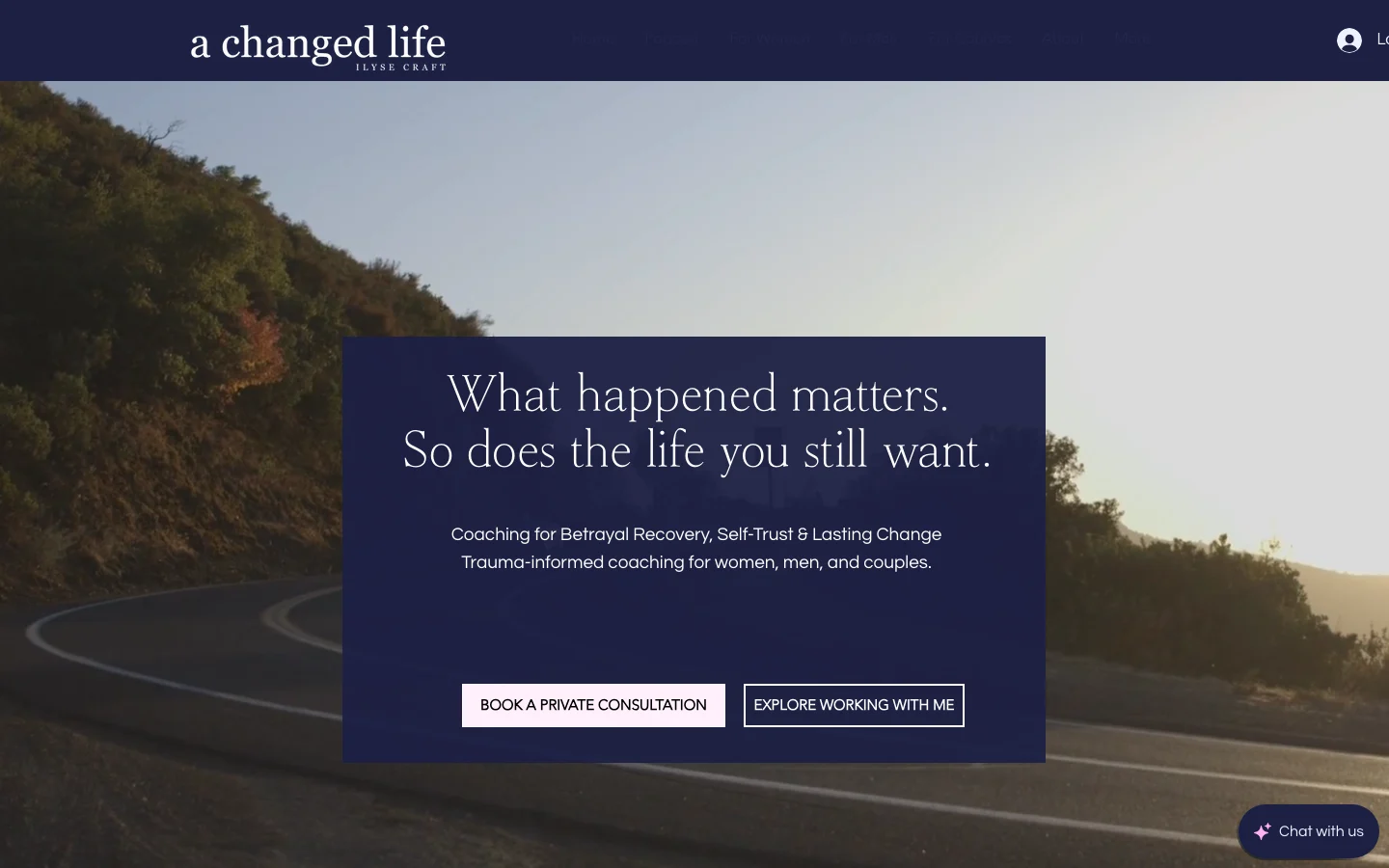
A Changed Life
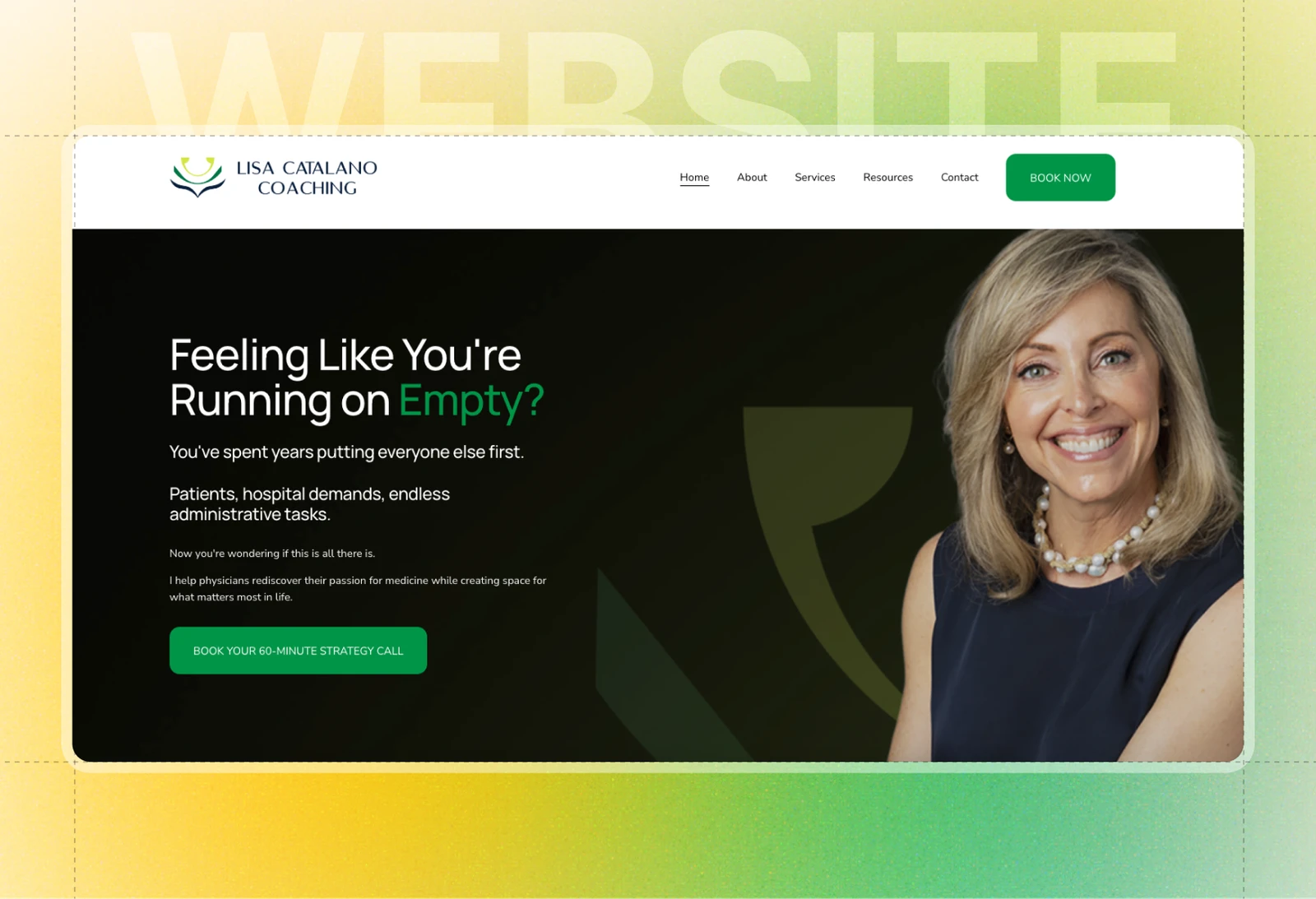
Lisa Catalano Coaching
Co-Momentum Leadership
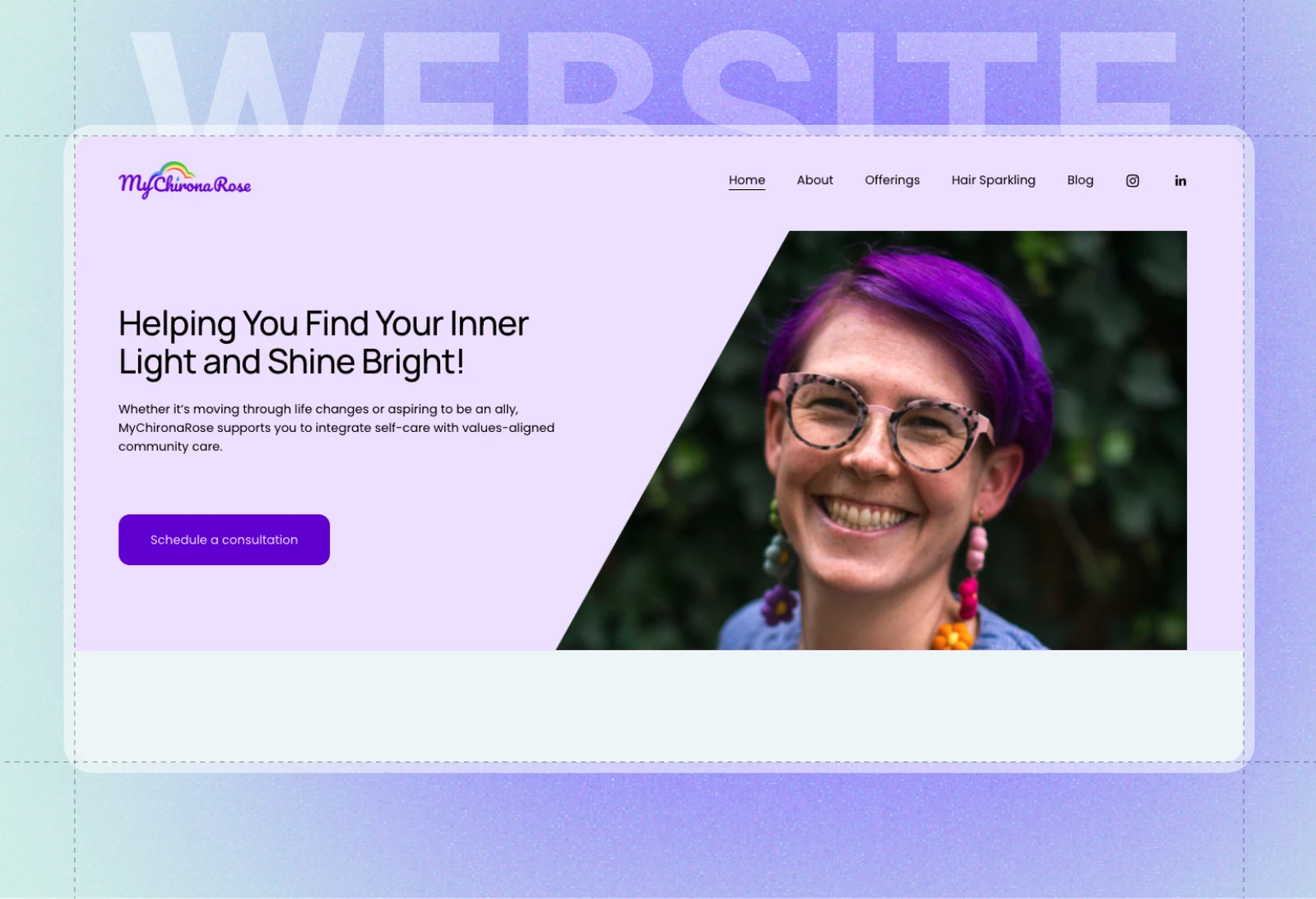
MyChironaRose
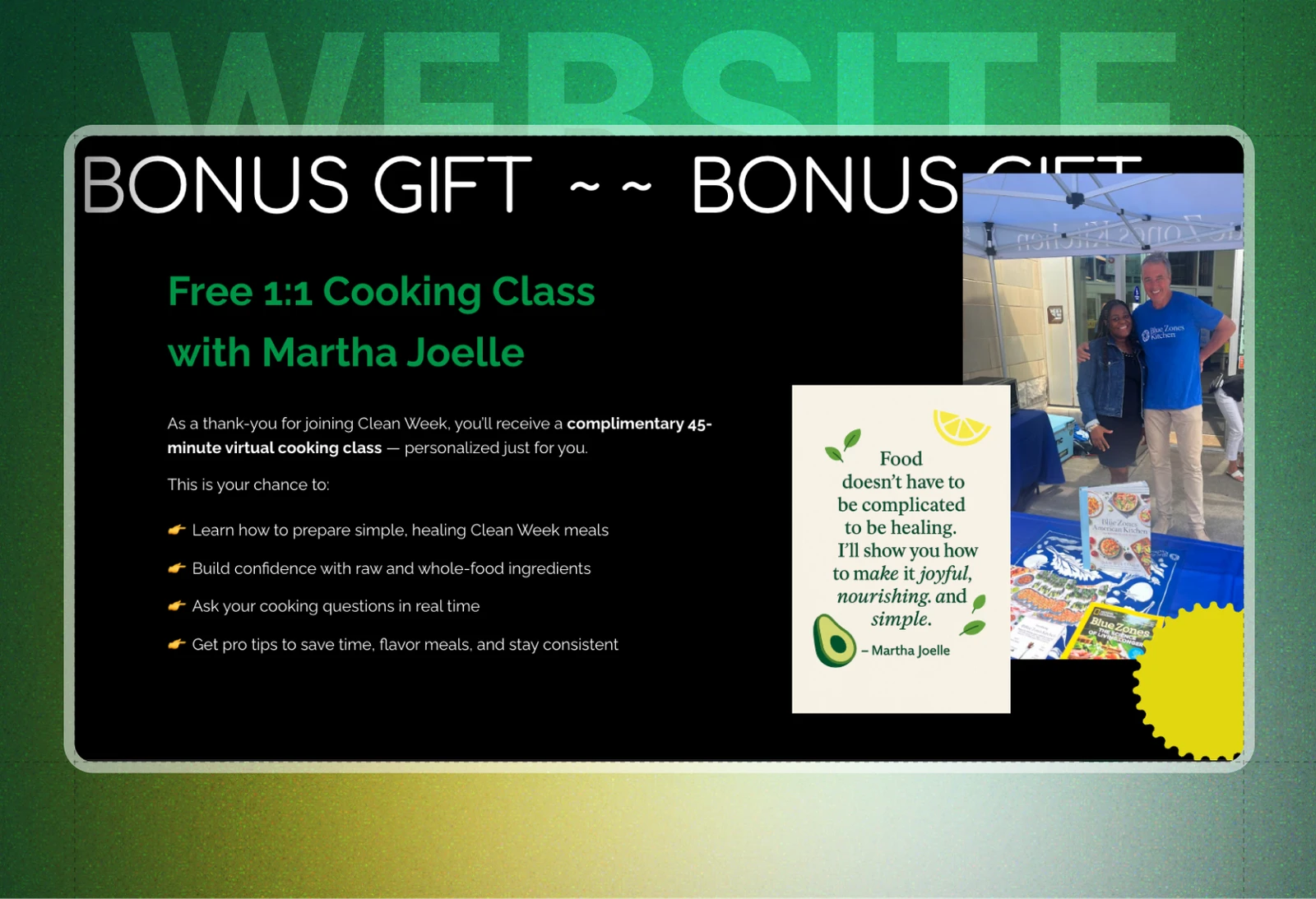
Eat Clean
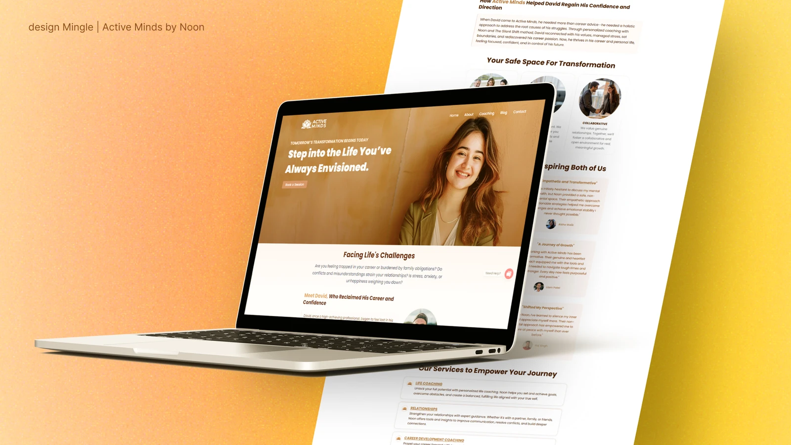
Active Minds
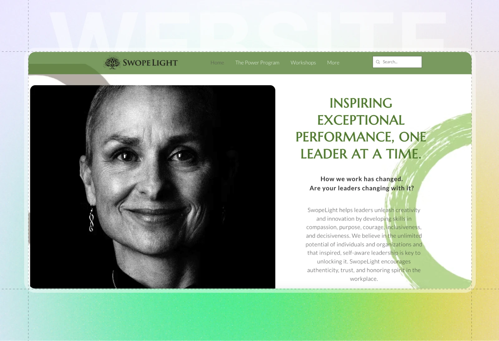
Swopelight
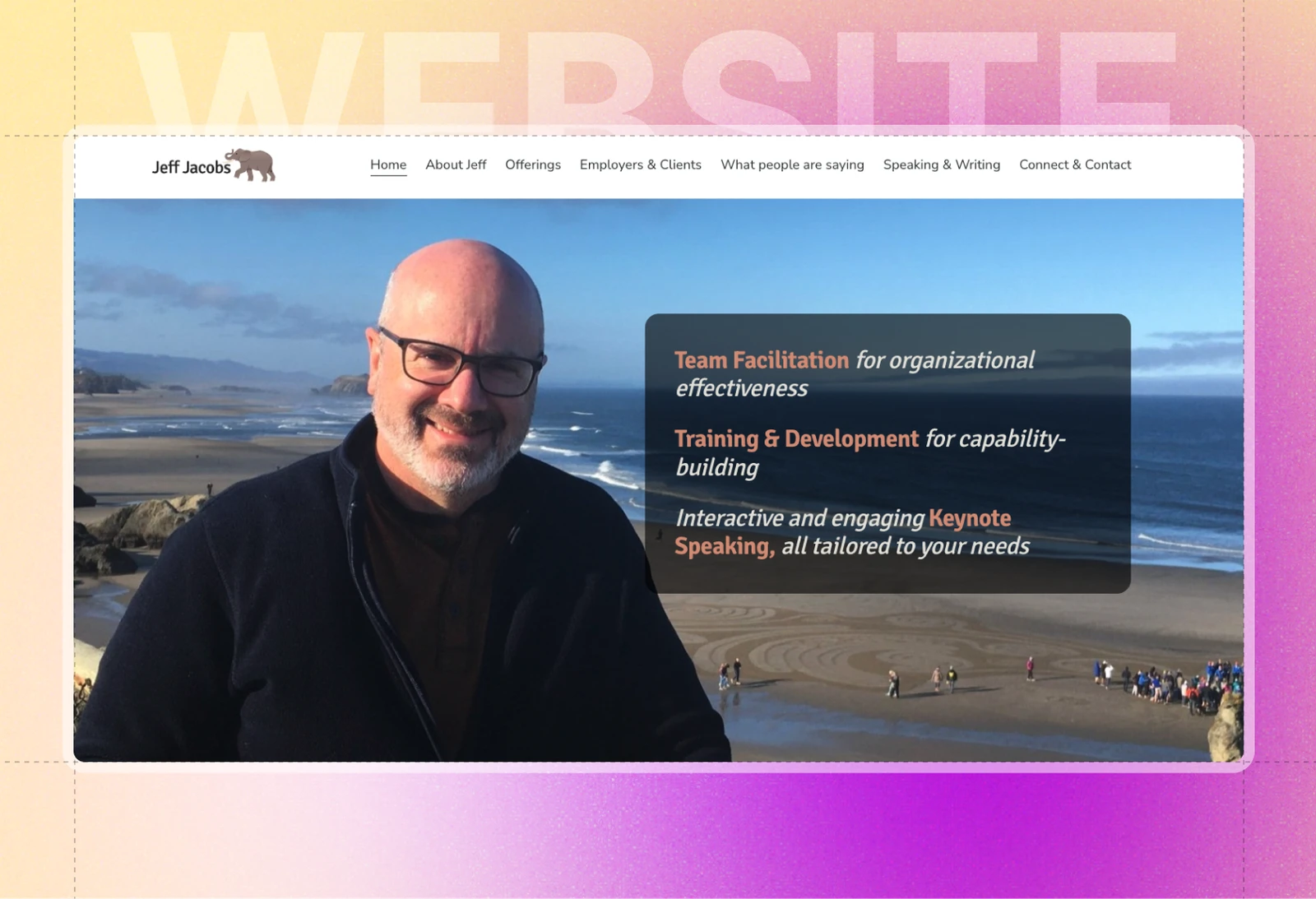
Jeff Jacobs
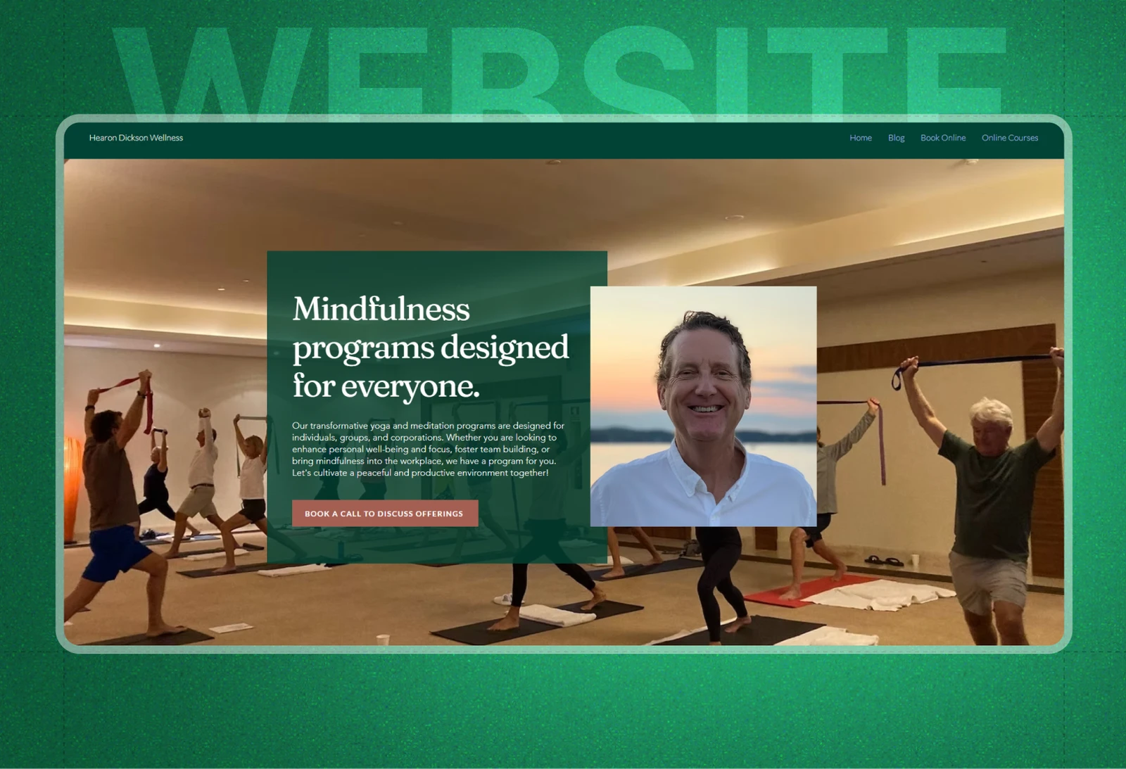
Hearon Dickson Wellness
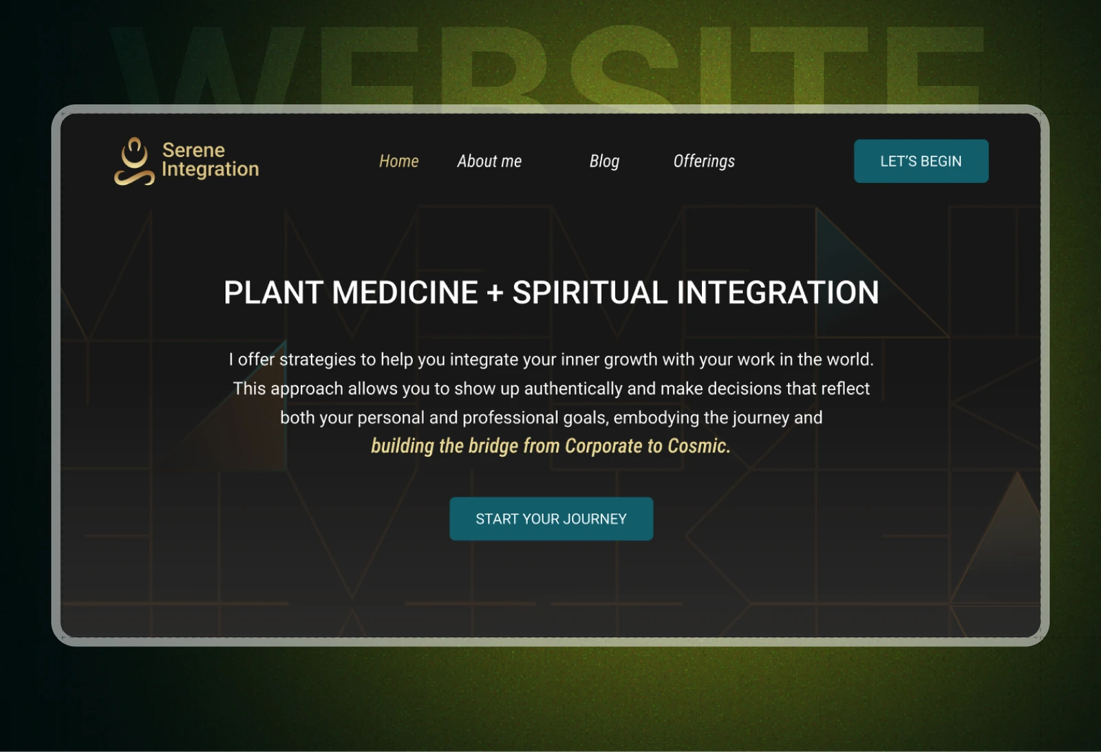
Serene Integration
More website designs
A selection of coaching websites we've designed: structure, storytelling and conversion built into every page.
LinkedIn profile optimization
LinkedIn profile optimization: banner, headline, About section and Featured cards rebuilt as a landing page.
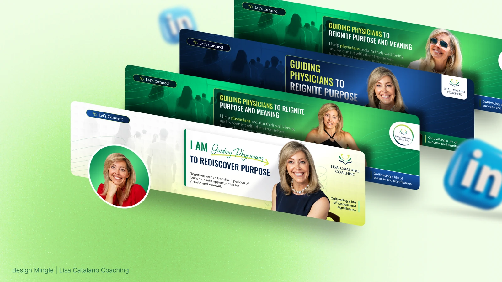
Lisa Catalano Coaching
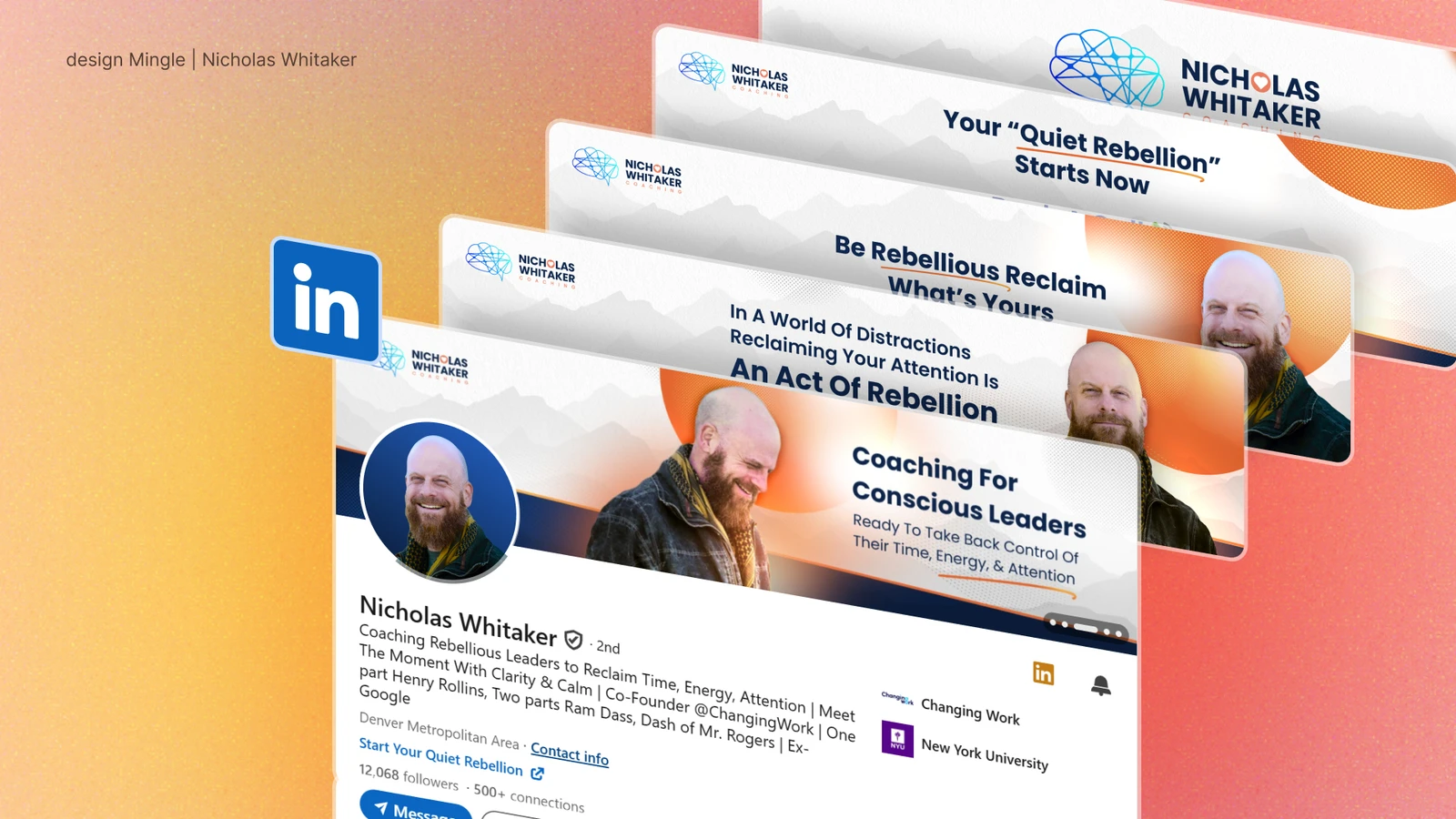
Nicholas Whitaker Coaching & Rebellion Collective
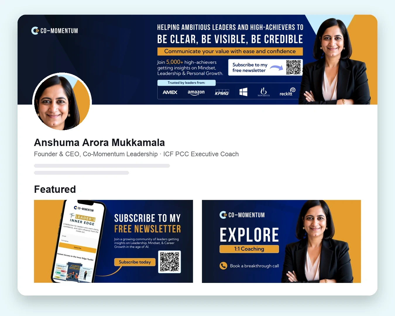
Co-Momentum Leadership
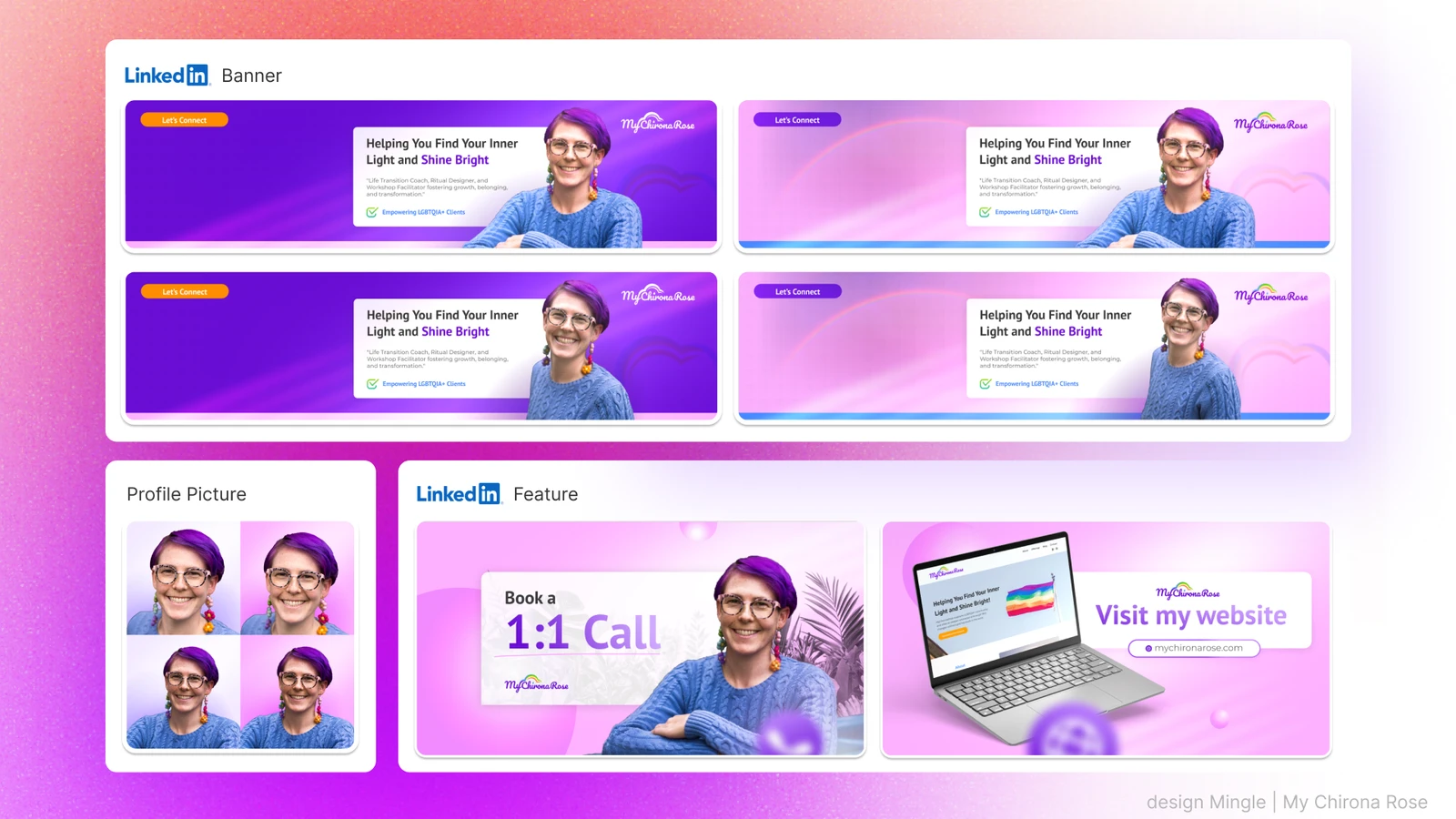
MyChironaRose
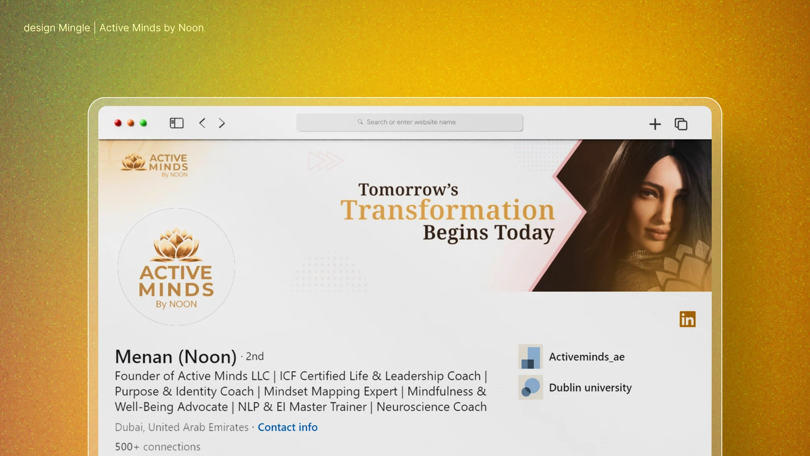
Active Minds
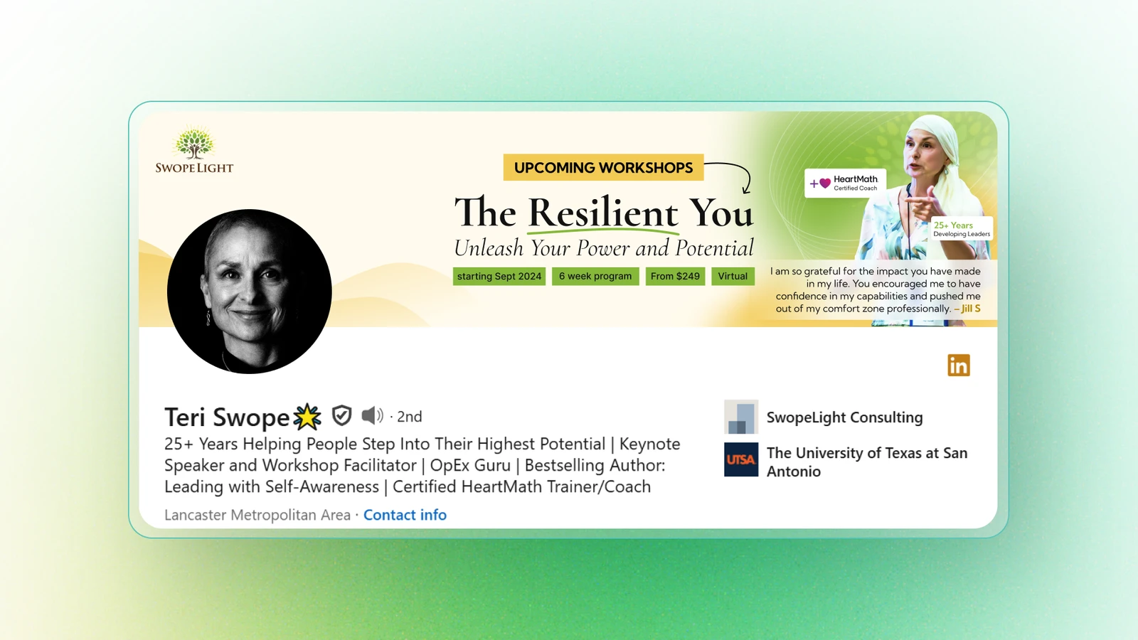
Swopelight
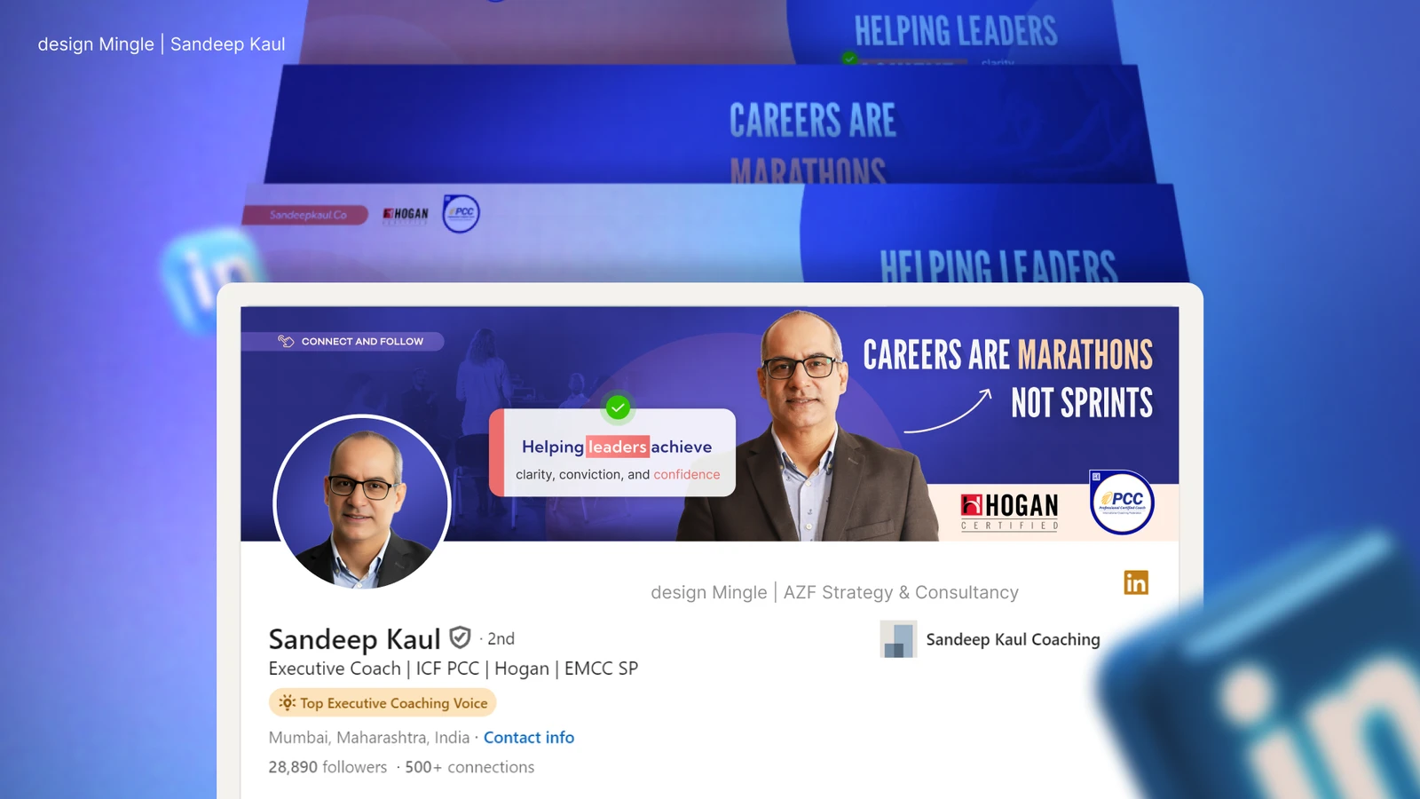
Sandeep Kaul
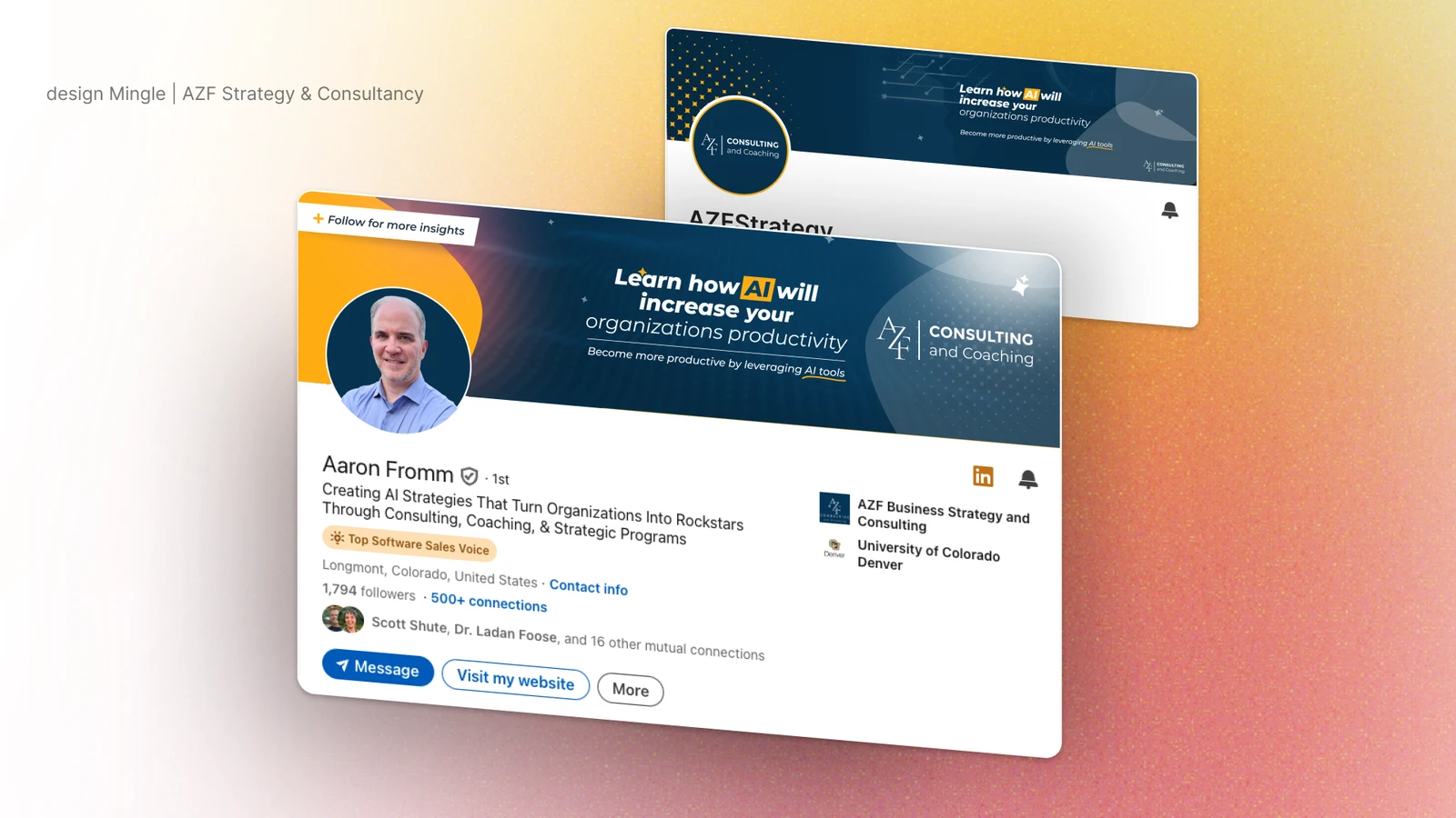
AZF Consultancy
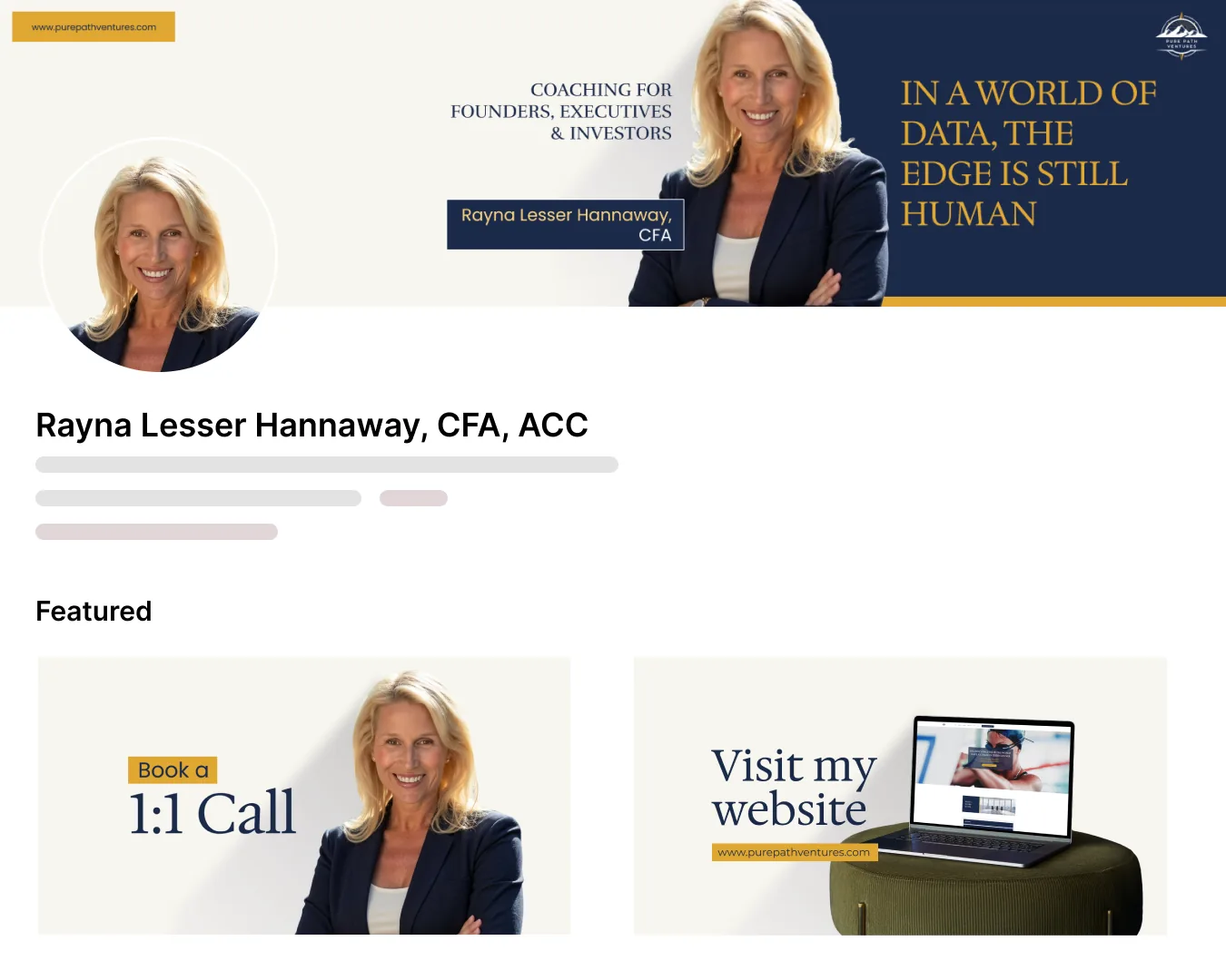
Pure Path Ventures
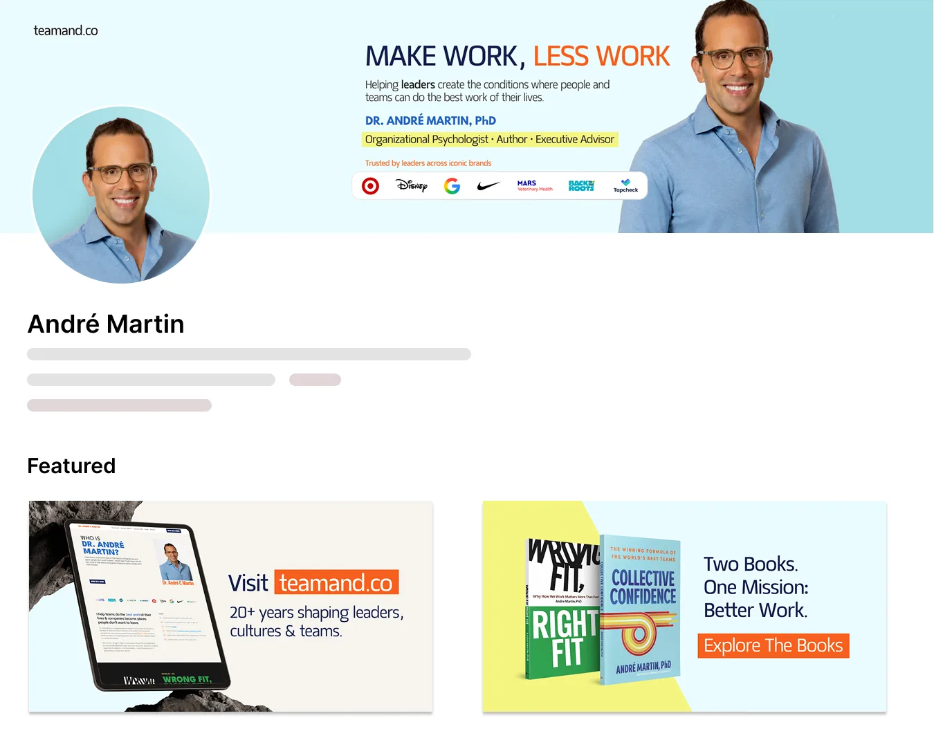
TeamAnd
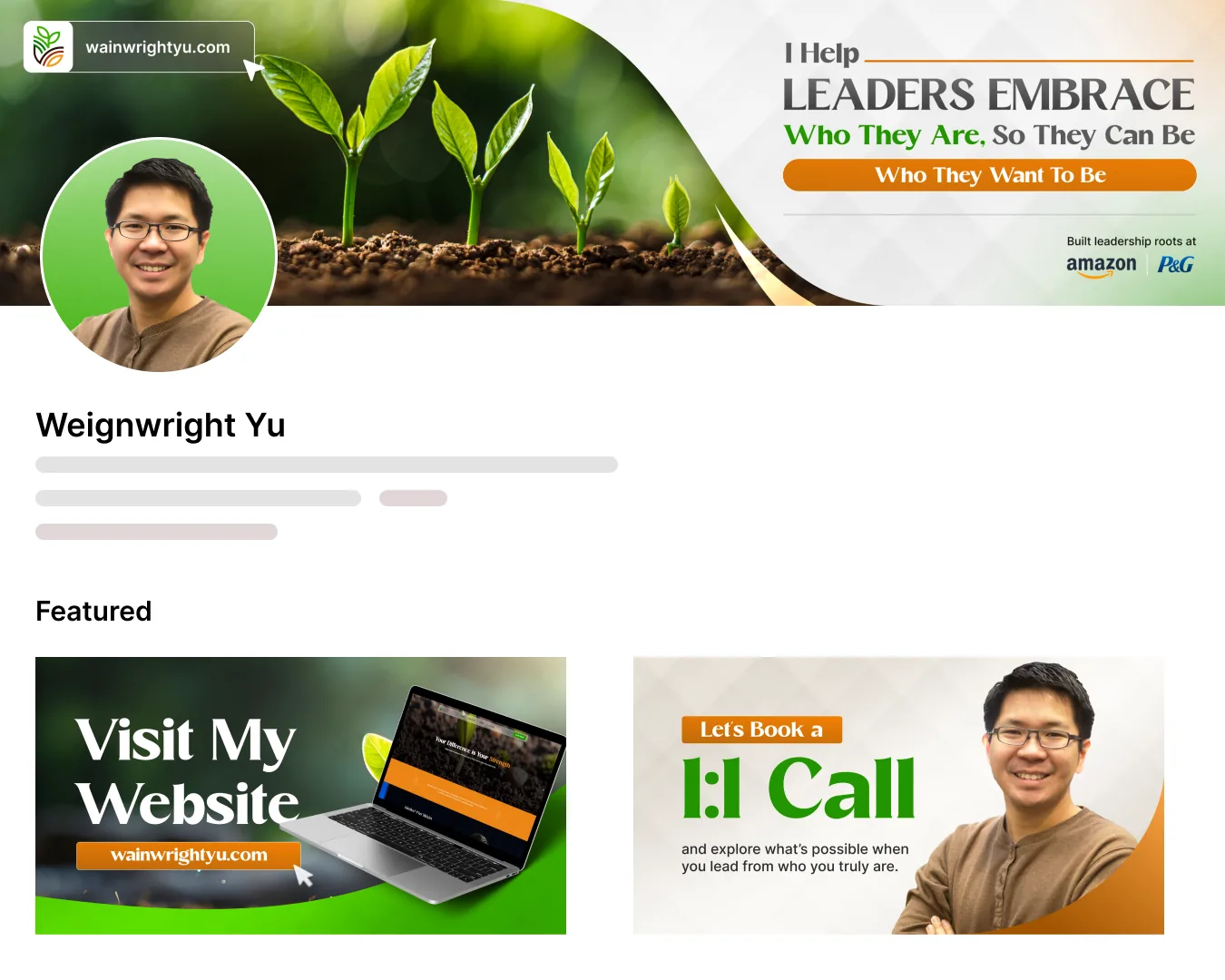
Wainwright Yu
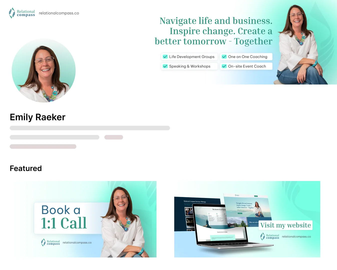
Emily Raeker
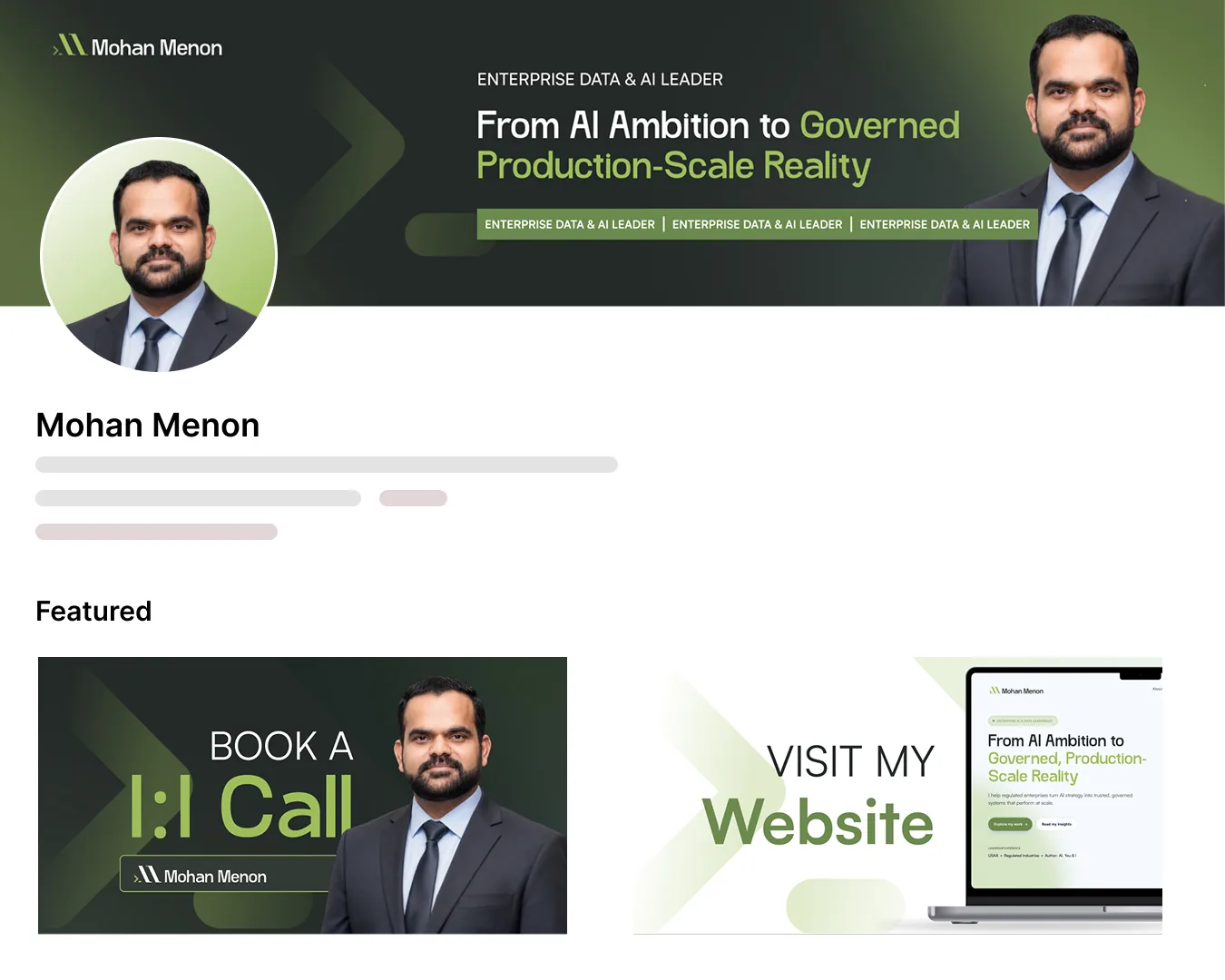
Mohan Menon
Promotional social graphics
Promotional social graphics: carousels, posts and covers designed in each client's visual system.
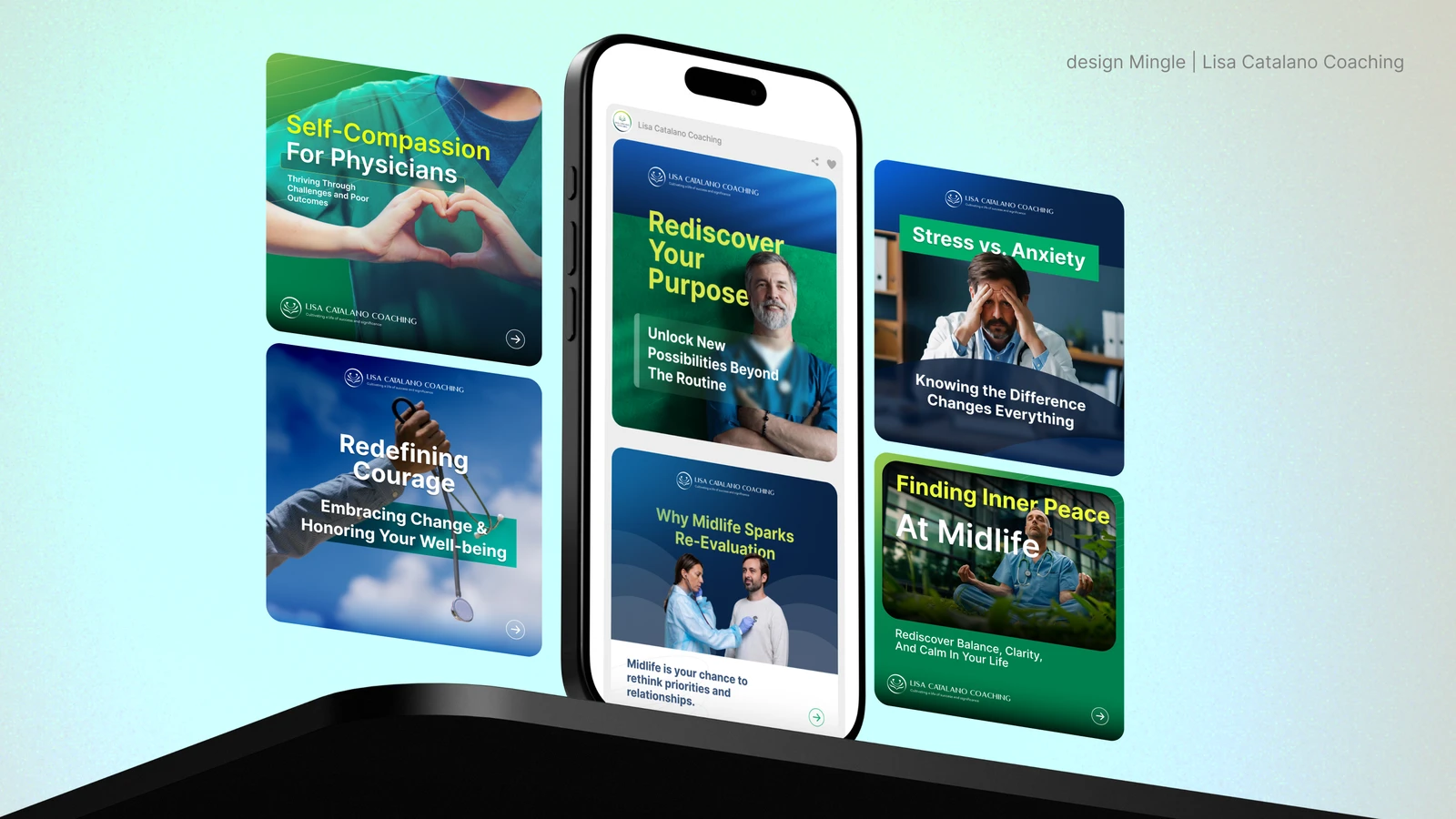
Lisa Catalano Coaching
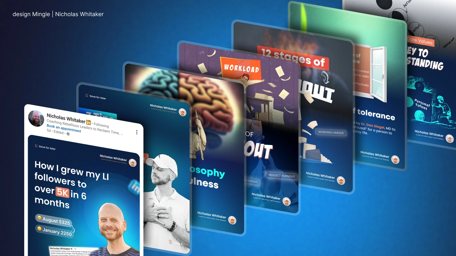
Nicholas Whitaker Coaching & Rebellion Collective
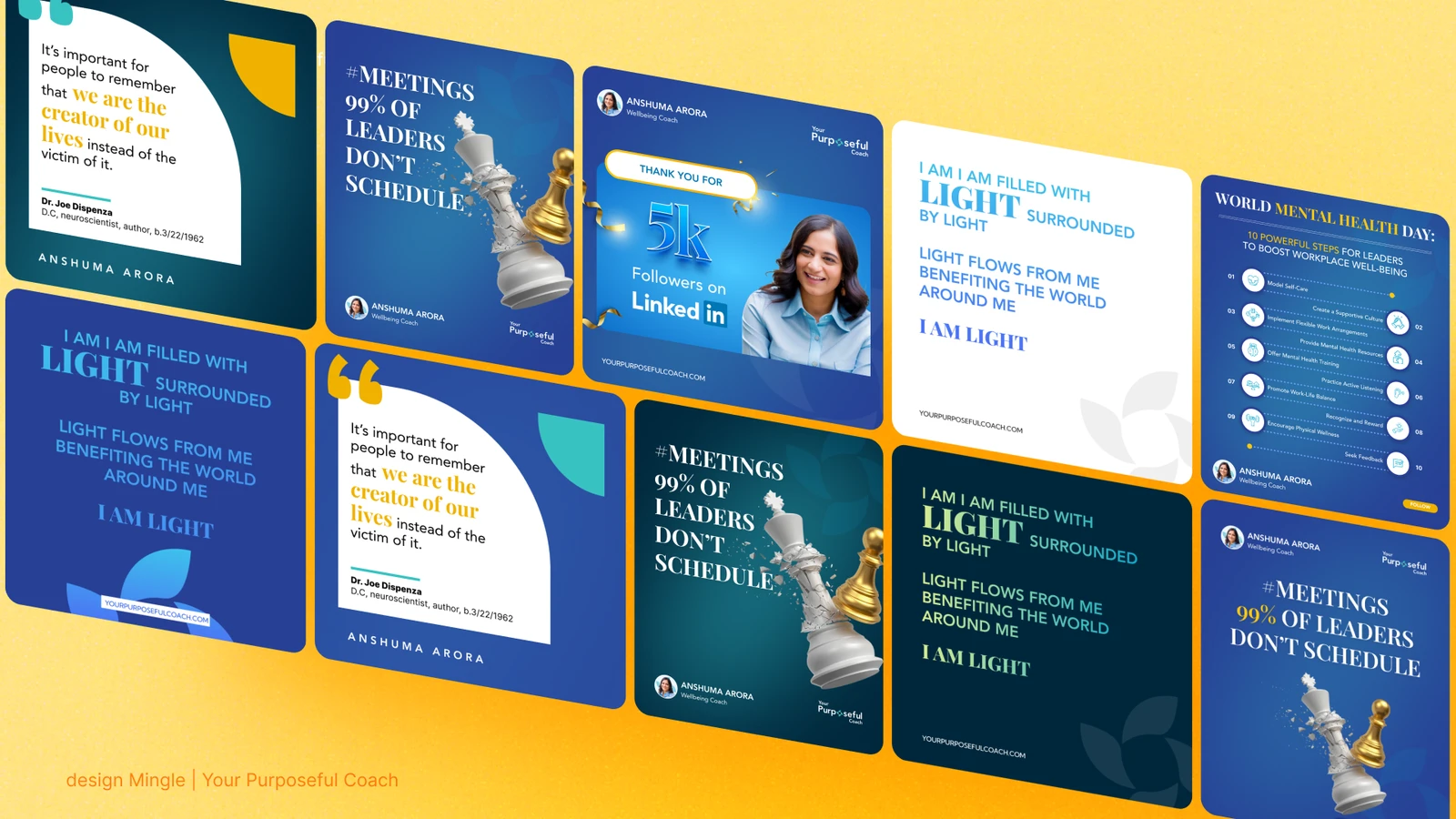
Co-Momentum Leadership
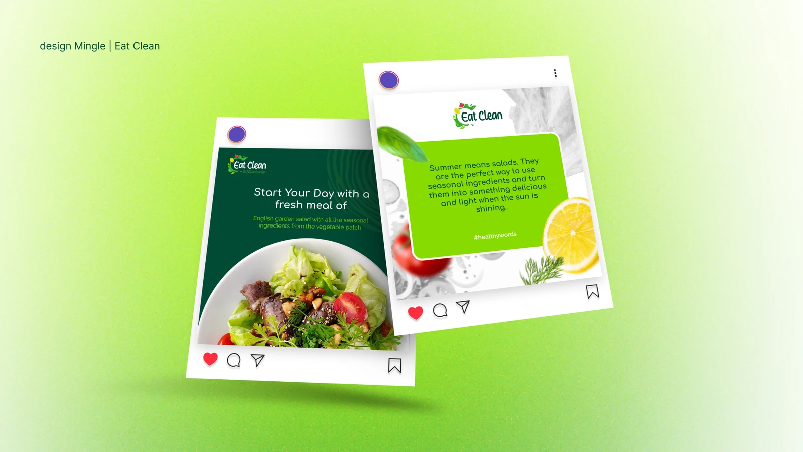
Eat Clean
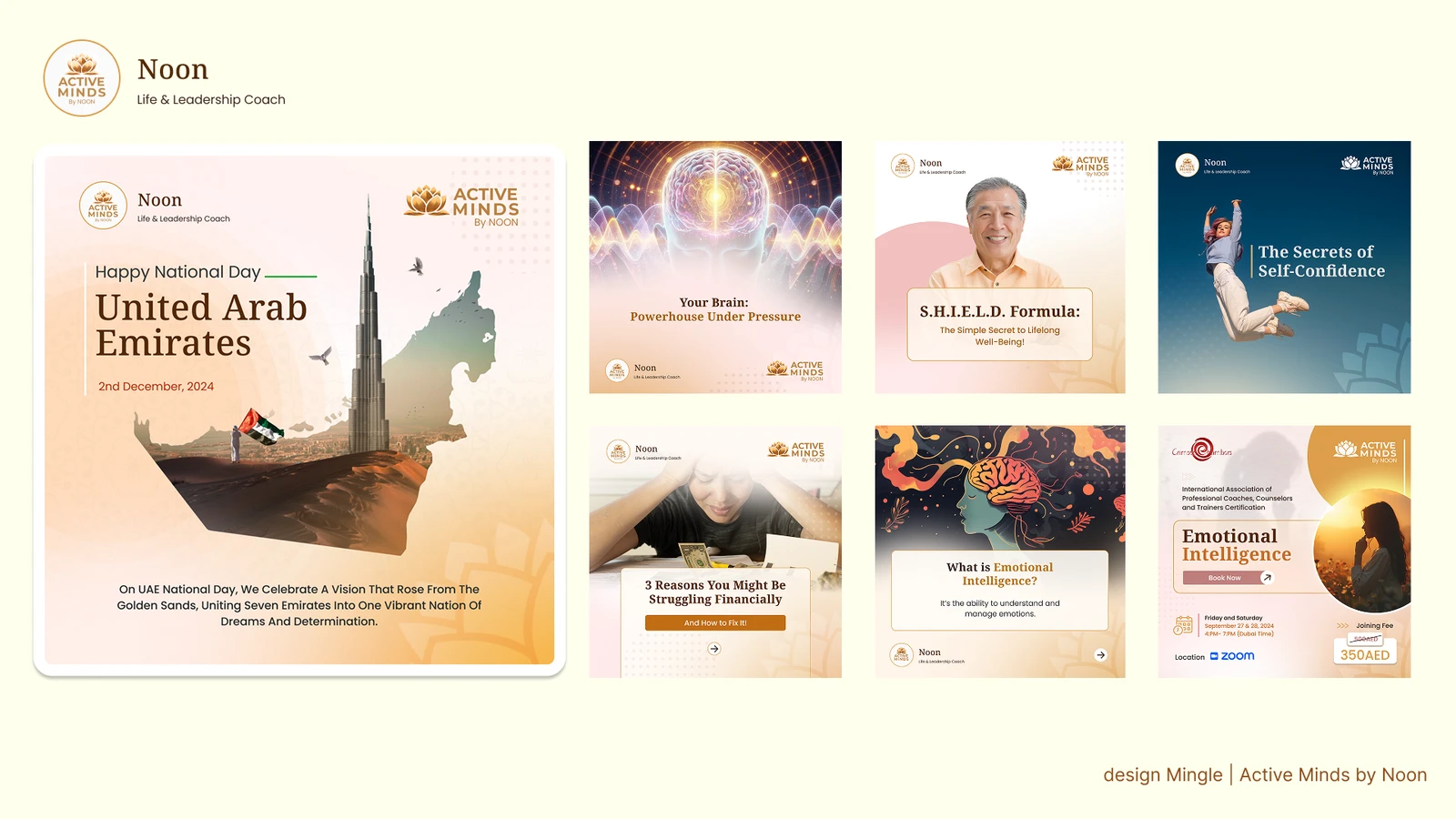
Active Minds
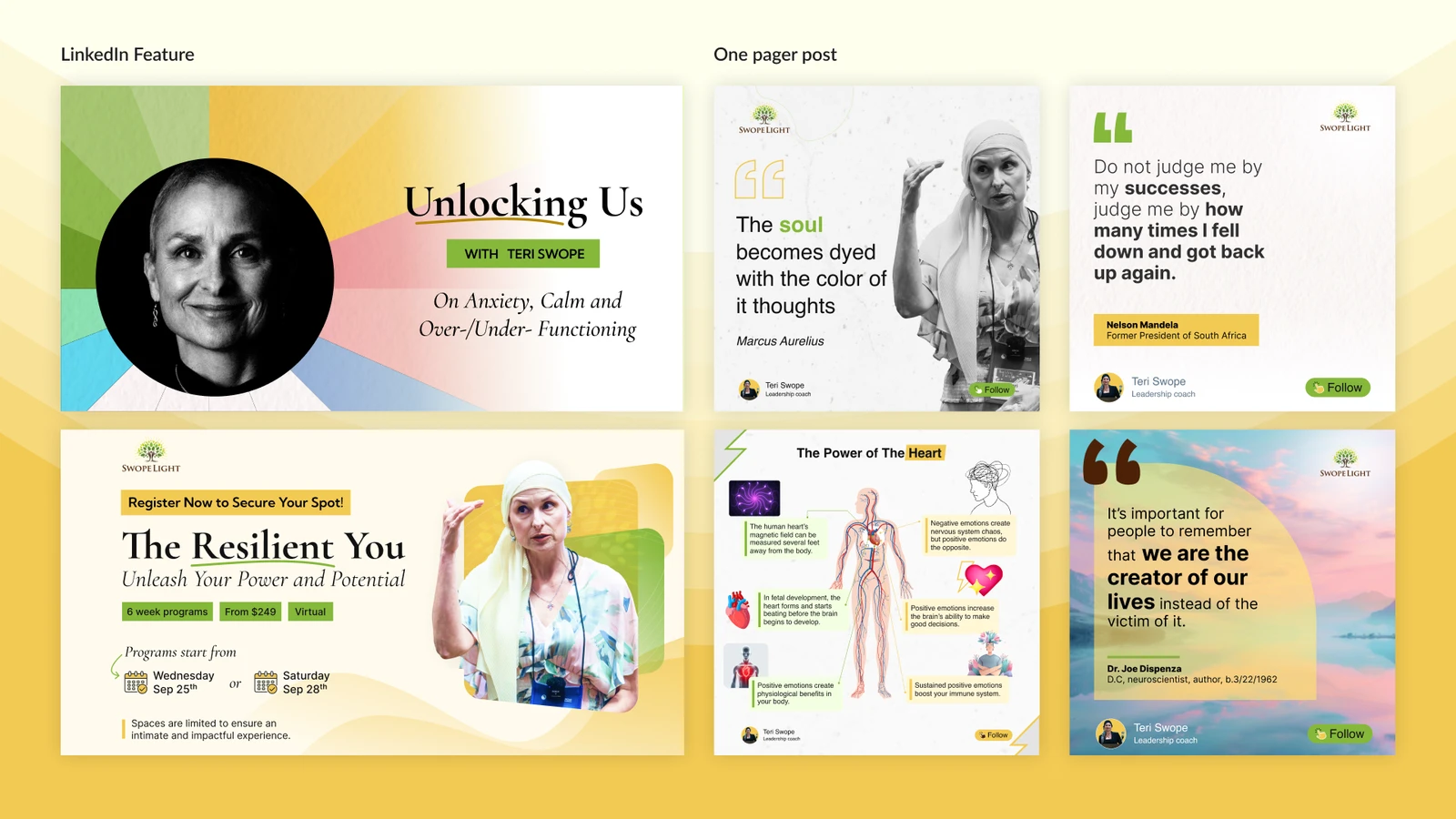
Swopelight
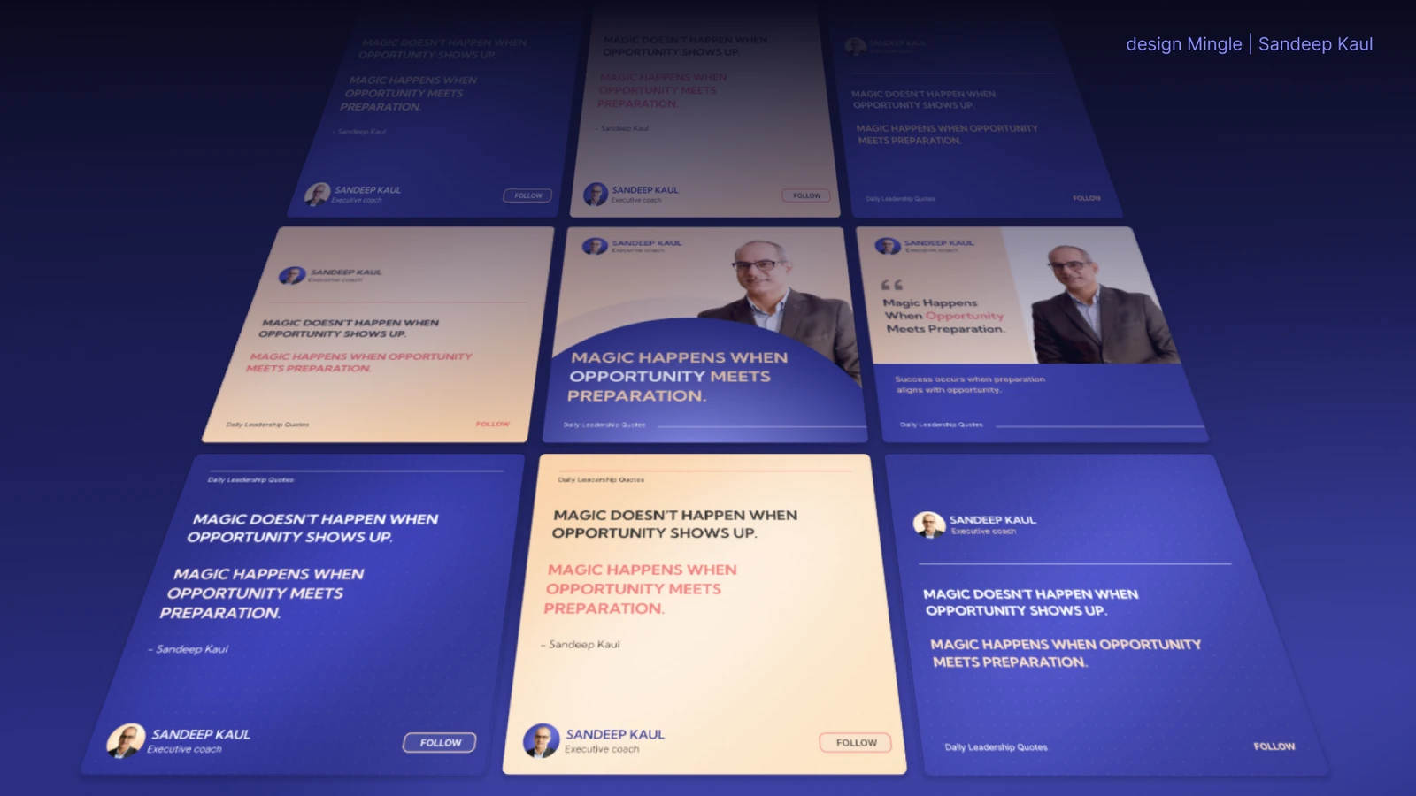
Sandeep Kaul
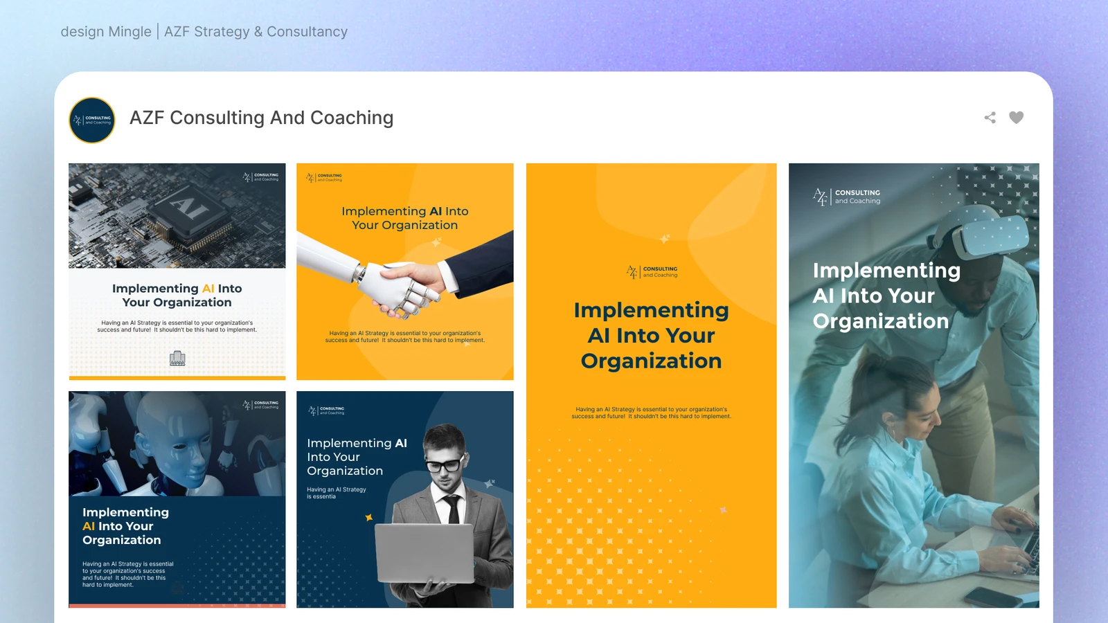
AZF Consultancy
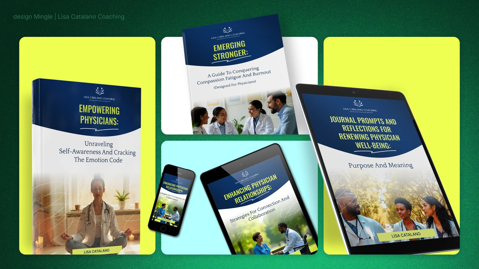
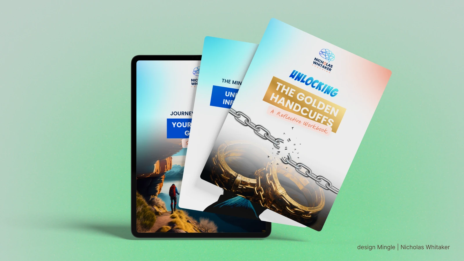
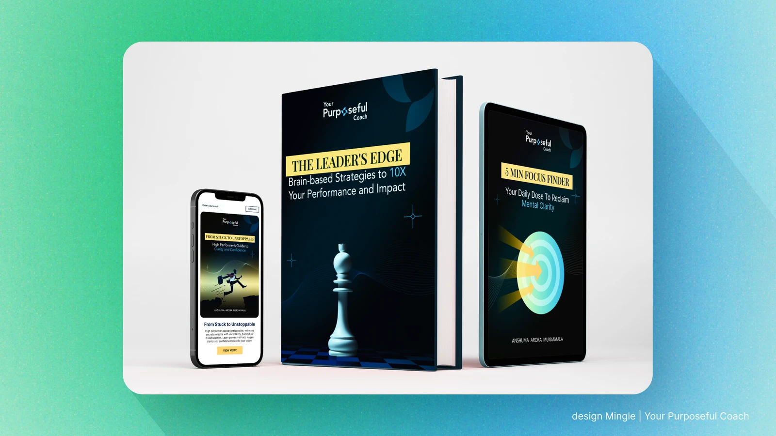
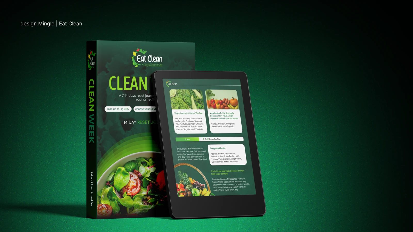
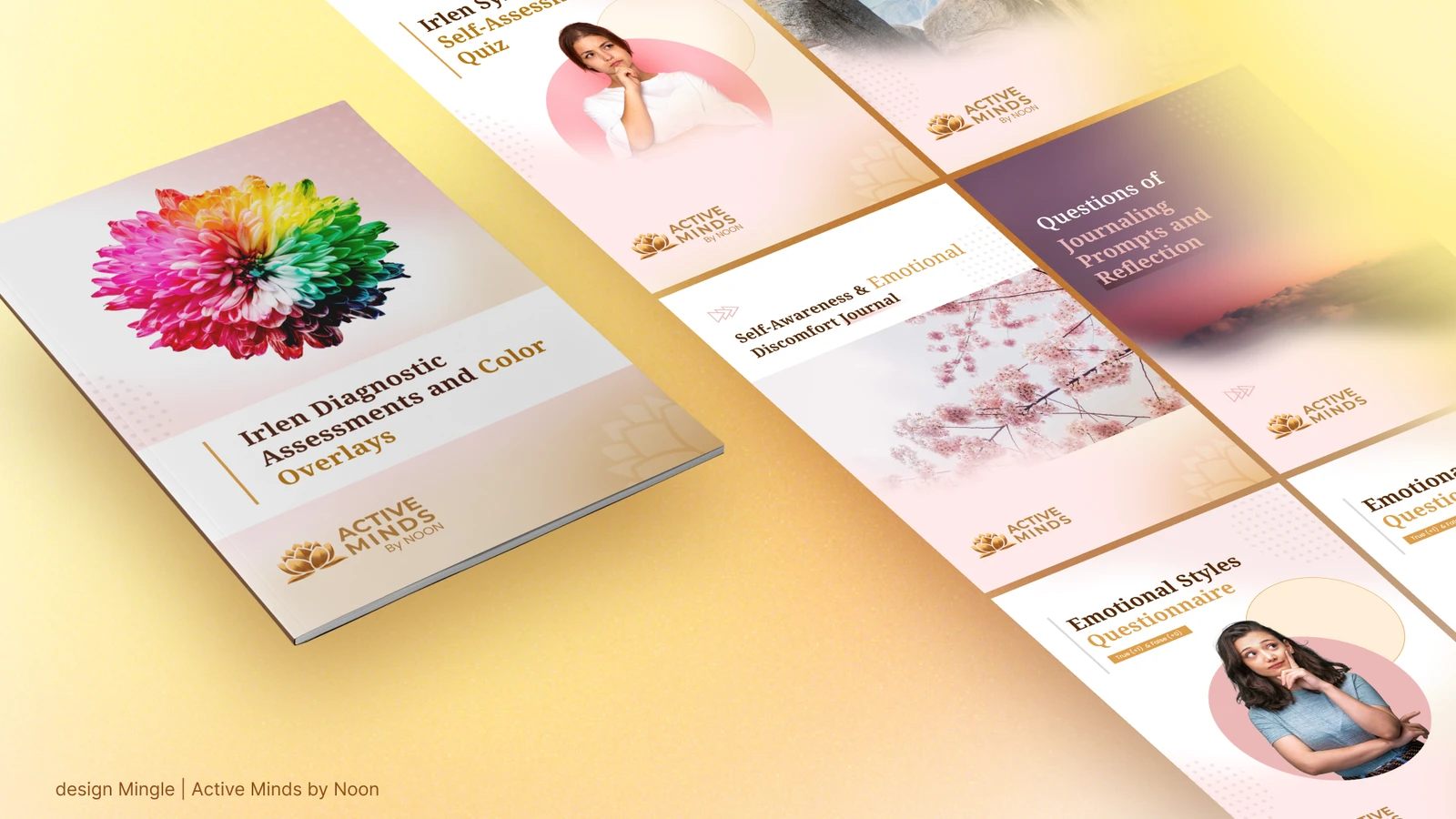
Lead Magnet & E-books
Lead magnets and e-books that share a coach's expertise and grow the email list.
Podcast & Reel edits
Short-form edits and promotional videos for social media, podcasts and programmes.
POWER Program promotional edit
POWER Program video edit
Short-form social clip
Summit promotional video
Celebration promotional video
Needs Improvement podcast intro
Podcast short
Podcast short
Promotional video for social
Social media short
Promotional video
Why leaders need emotional intelligence