- A coaching brand identity is more than a logo: it's positioning, a symbol, colours, typography and rules that make everything look like one business.
- Start with strategy (who you serve and how you want them to feel) before any design work.
- Hand-sketching many ideas before going digital leads to more original, meaningful marks than starting from templates.
- A good brand system makes every future website page, LinkedIn post and e-book faster and more consistent.
Branding for coaches often starts with a logo request: "I just need something professional." But the coaches who grow fastest treat their brand as a business asset, a system that makes them recognisable, credible and easy to choose.
This guide walks through how a coaching brand identity is built, step by step, using the same process we follow at DesignMingle.
What is a coaching brand identity?
A brand identity is the visual and verbal system that represents your coaching business. It typically includes:
- Positioning: who you help, the change you create and what makes you different.
- Logo and symbol: the mark people remember.
- Colour palette: primary and supporting colours with clear roles.
- Typography: fonts for headings and body text.
- Visual style: photography, icons, patterns and layout principles.
- Guidelines: simple rules so every future asset stays consistent.
Your brand is what clients experience at every touchpoint. The identity is the toolkit that makes that experience consistent.
Step 1: Strategy before design
Before sketching anything, answer these questions:
- Who is your ideal client, specifically? (Role, life stage, challenge.)
- What transformation do you help them make?
- How should they feel when they see your brand: calm, energised, safe, challenged?
- Which coaches or brands do they already know, and how will you stand apart?
- Where will the brand live most: LinkedIn, a website, workshops, a podcast?
A coach for burnt-out physicians and a coach for ambitious start-up founders need very different brands, even if both are excellent coaches.
Step 2: Explore ideas with hand sketches
This is where our process differs from template-based logo design. We start on paper, sketching many ideas quickly: initials, symbols, metaphors from nature, shapes that represent movement or connection. Sketching is fast and free, so we can explore dozens of directions before committing to one.
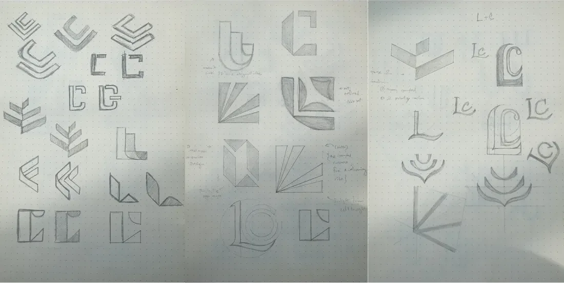
Many of our marks are inspired by nature: leaves, flames, flowers, pathways. Natural forms carry meaning that clients feel intuitively (growth, warmth, resilience) without needing explanation.
Step 3: Choose the strongest concept and refine it
From the sketches we select the ideas that best express the brand strategy, then simplify. A good coaching logo should:
- be recognisable at small sizes (a LinkedIn profile picture or browser tab);
- work in one colour as well as full colour;
- carry a meaning you can explain in one sentence;
- feel distinct from other coaches in your niche.
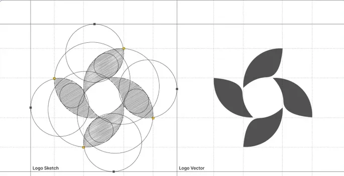
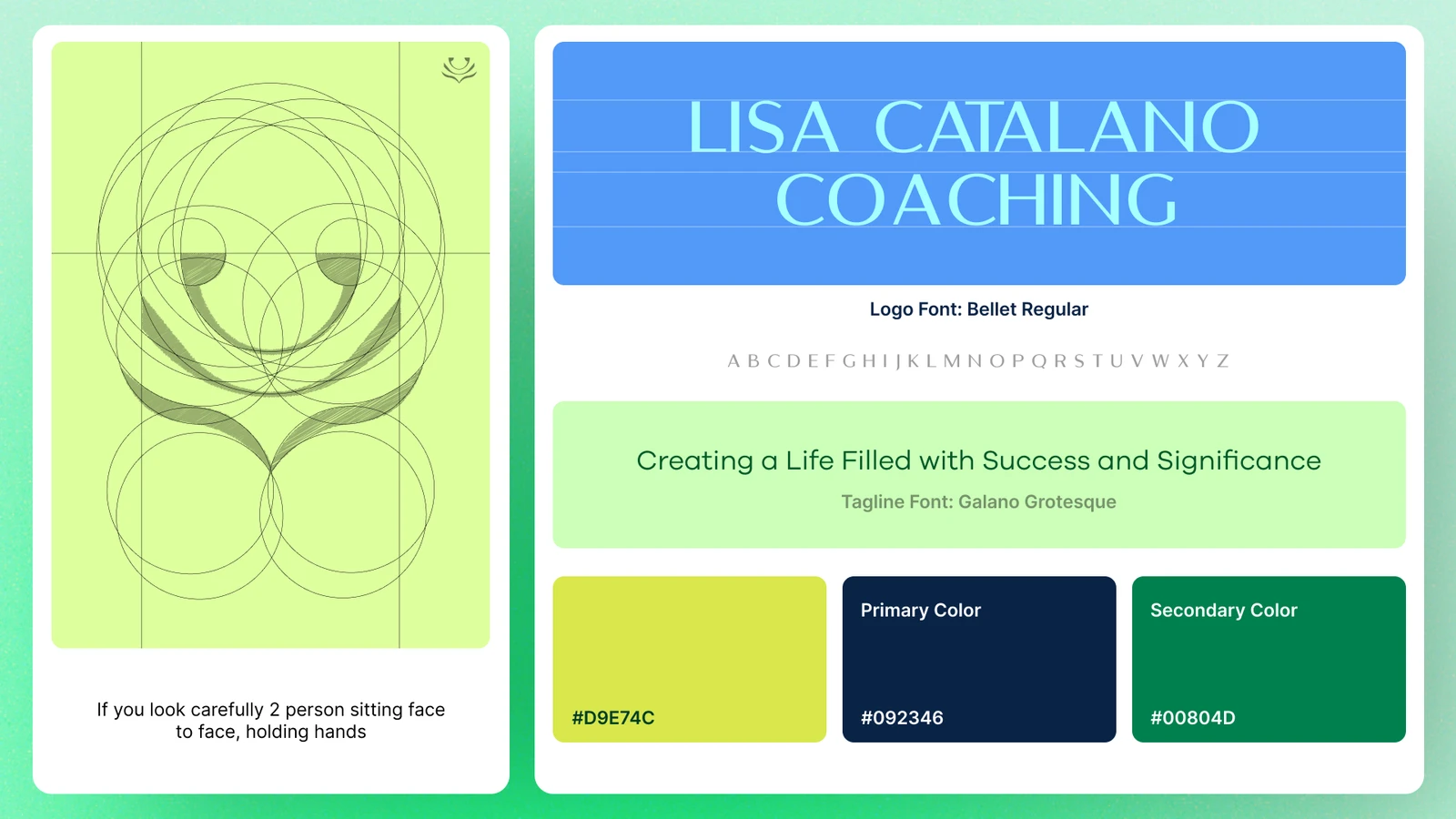
Refinement happens on a grid: balancing curves, line weights and spacing so the mark looks precise and confident. This is the difference between a logo that looks homemade and one that looks like it belongs to an established practice.
Step 4: Build colour and typography
Colour does a lot of emotional work. Deep greens and blues tend to signal calm and trust; warm oranges and pinks feel energetic and human; neutrals add sophistication. Most coaching brands need:
- one or two primary colours that people associate with you;
- a few supporting colours for backgrounds, highlights and charts;
- a neutral dark and light for text and space.
For typography, choose one font family for headings and one for body text (they can be the same). Clear, readable fonts beat decorative ones, especially for content people read on their phones.
Step 5: Turn it into a system you can use everywhere
A logo alone doesn't make a brand. The value comes when the identity is applied consistently: website, LinkedIn banner and Featured images, social post templates, e-book covers, slide decks, email signature and business cards.
For Rebellion Collective, we built a brand family: one parent mark (a flame holding a heart) and four sub-brands for different experiences, all connected through shared typography, colour foundations and flame symbolism. Each branch has its own personality, yet everything clearly belongs to one movement.
Common coaching branding mistakes
- Choosing a logo because it looks nice, not because it expresses your positioning.
- Using clichés every coach uses: generic trees, lightbulbs, mountain peaks and puzzle pieces.
- Picking too many colours and fonts, so nothing feels consistent.
- Designing only a logo and improvising everything else later.
- Copying a coach you admire instead of building something that fits your own clients.
- Ignoring how the logo looks as a tiny LinkedIn or browser icon.
What to prepare before working with a brand designer
You'll get a better result, faster, if you bring a few things to the first conversation:
- A short description of your ideal clients and the outcome you help them reach.
- Three to five words that describe how you want people to feel about your brand.
- Brands you admire (inside or outside coaching) and what you like about them.
- Where the brand will appear first: website, LinkedIn, workshops, a book or a podcast.
- Any existing materials, including what you like and dislike about them.
Why a consistent brand helps you get found
Consistency doesn't only help people remember you. When your name, niche and description match across your website, LinkedIn, articles and directory profiles, search engines and AI assistants can connect the dots more easily and describe you accurately. A clear brand story makes you easier to recommend, by people and by machines.
How long does a coaching brand identity take?
A focused identity (strategy, sketches, logo, colour, typography and guidelines) usually takes a few weeks, depending on how many rounds of feedback are needed. Applying it across a website and LinkedIn adds a few more weeks. It's an investment you make once and use for years.
DIY logo vs. professional brand identity
| DIY or template logo | Professional brand identity | |
|---|---|---|
| Originality | Often shared with many other businesses | Unique to your story and niche |
| Consistency | Logo only, no system | Colours, fonts and rules for every asset |
| First impression | Can look like a side project | Looks established and credible |
| Long-term cost | Often redone within a year or two | Built to last as the business grows |
Hand-sketched, nature-inspired identities built as long-term brand assets.
Frequently asked questions
What should a coaching logo include?
A simple, memorable mark that works at small sizes and in one colour, paired with your name in a clear typeface. The best coaching logos carry a meaning connected to the transformation you create, such as growth, connection or direction.
Do coaches need a full brand identity or just a logo?
A logo on its own rarely creates consistency. A brand identity adds colours, typography and simple rules, so your website, LinkedIn and content all look like one professional business.
Why start a logo with hand sketches?
Sketching lets designers explore many ideas quickly before committing to one. It leads to more original, meaningful marks than starting from templates or icons.
How do I choose brand colours as a coach?
Start with how you want clients to feel, then pick one or two primary colours that express that feeling, plus supporting and neutral colours. Test them on your website and LinkedIn to make sure text stays readable.

Sabbir Hossien is the founder of DesignMingle, a design studio that builds brands, websites, LinkedIn presences and content for coaches. Every identity starts with hand sketches and is built as a long-term brand asset.
Connect on LinkedIn