
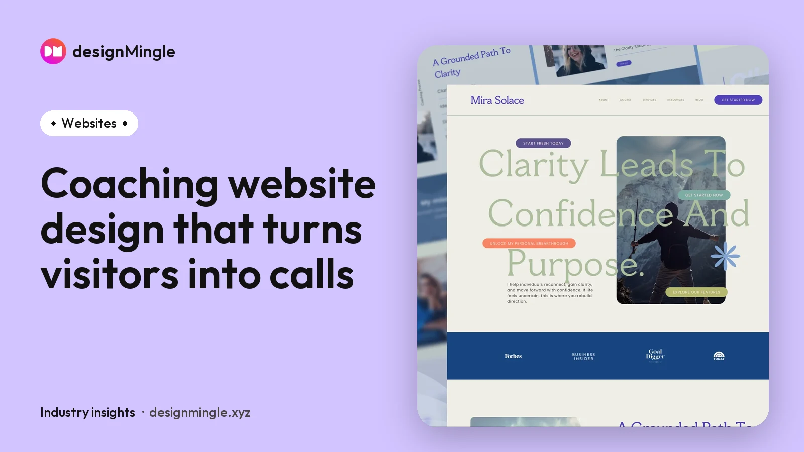
- A coaching website has one main job: help the right visitor understand your offer and book a call.
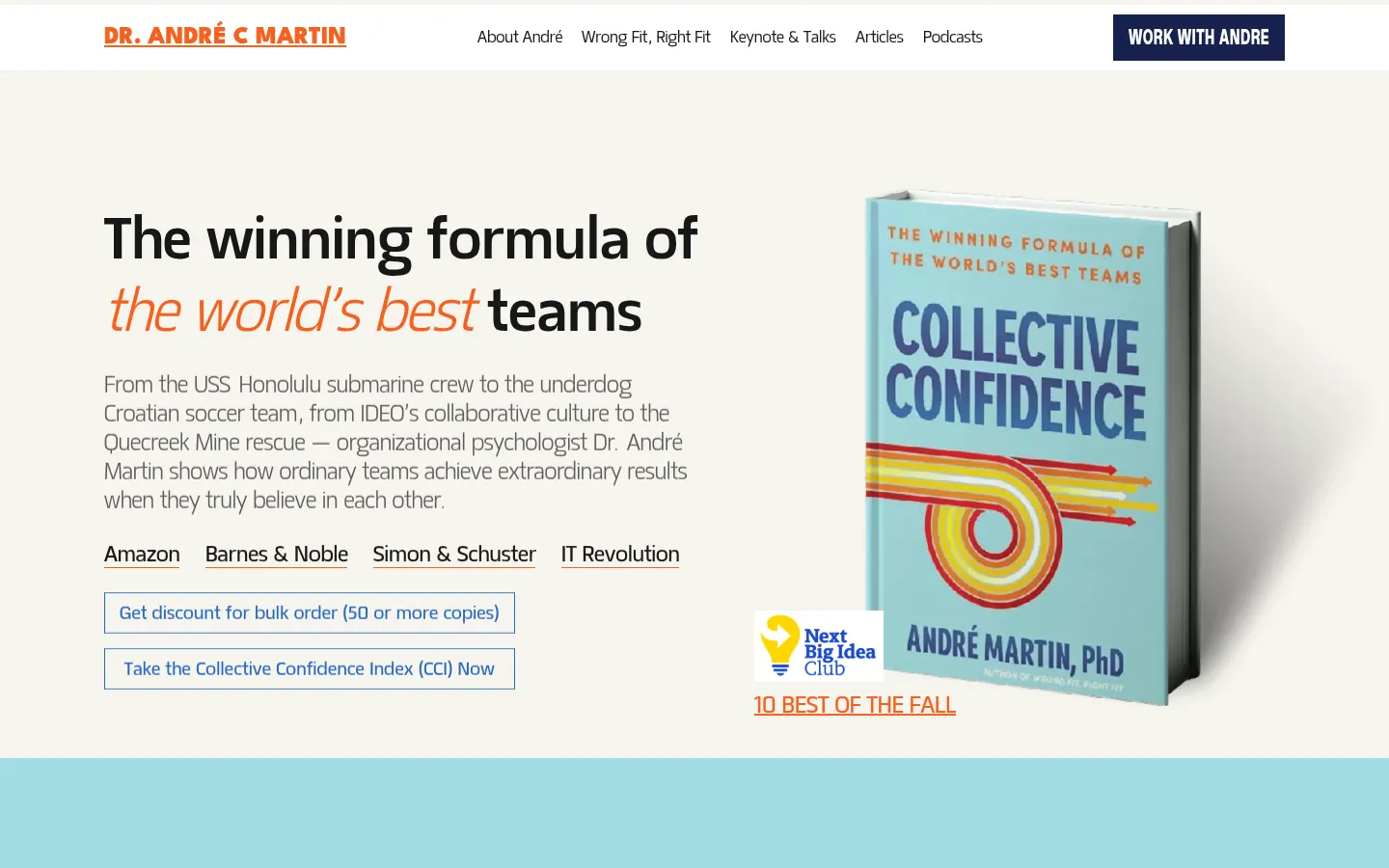
- The hero section matters most. Say who you help and the outcome in one clear sentence, with one obvious button.
- Proof (testimonials, case studies, logos, credentials) should appear early, not hidden on a separate page.
- Most visitors arrive on a phone, often from LinkedIn. Design for mobile first and keep it fast.
Your website is the only place online that you fully own. Social platforms change their rules; your website stays yours. For coaches, it is also where most buying decisions happen: people discover you on LinkedIn or through a referral, then visit your site to decide whether to book.
Here are the nine elements that make the biggest difference to how many of those visitors become discovery calls.
1. A hero section that answers "is this for me?"
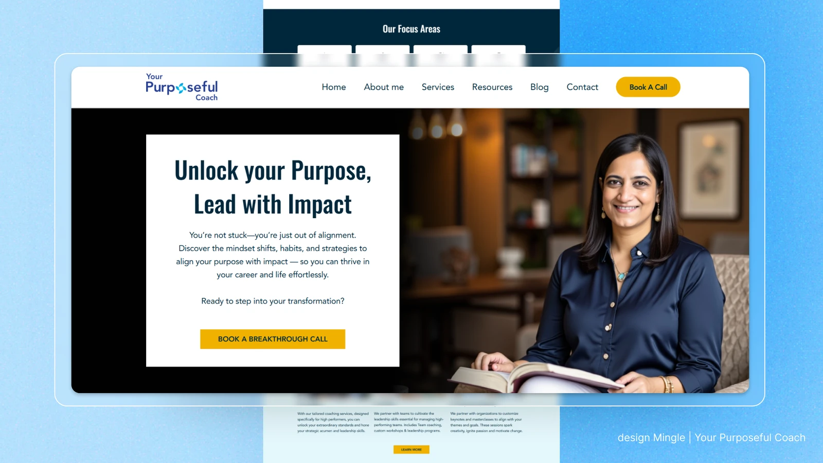
The top of your homepage should answer three questions in a few seconds: who you help, what changes for them and what to do next. For example: "Mindfulness coaching for high-performing leaders who want to lead with purpose, without burning out." Then one clear button: Book a discovery call.
Avoid vague slogans ("Unlock your potential") and avoid giving visitors five different buttons to choose from.
2. A professional portrait
People buy coaching from people. A warm, high-quality photo of you near the top of the page builds connection faster than any paragraph. Use the same photo style on LinkedIn so returning visitors recognise you.
3. Problem-first messaging
Write about your client before you write about yourself. Describe the situation they're in, in their own words, then show the outcome you help them reach. Your biography belongs on the About page and in a short section further down the homepage.
4. Proof near the top
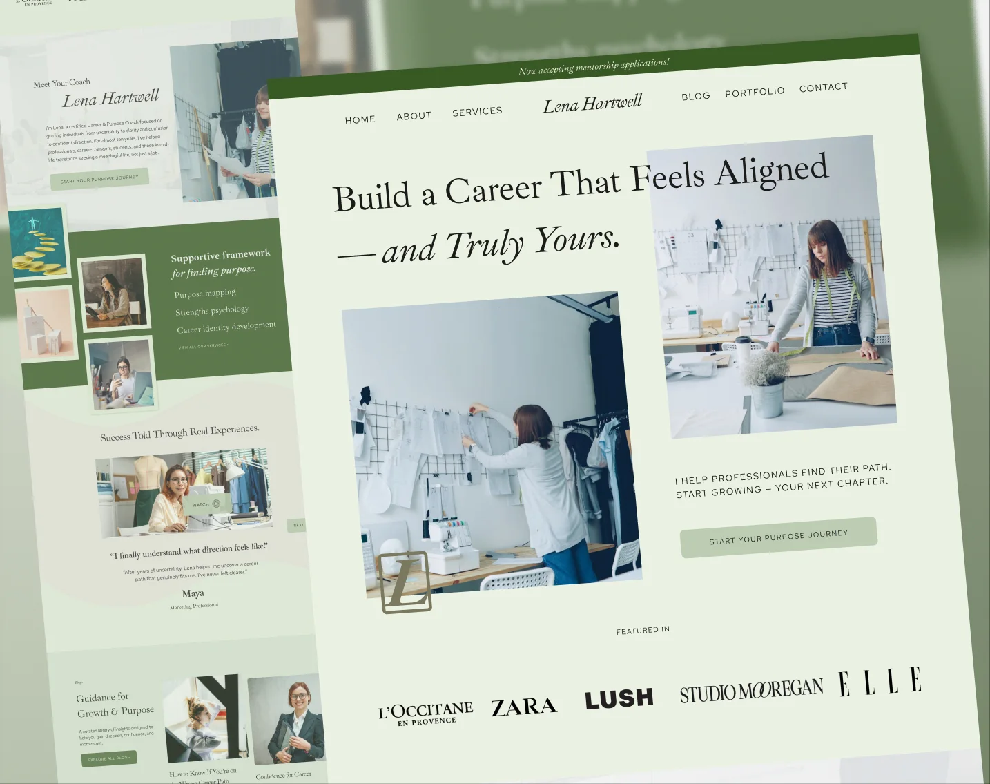
Place a few testimonials, client logos, credentials (for example ICF accreditation) or media mentions close to the hero. Video testimonials are especially effective. Don't make visitors hunt for evidence on a separate page.
5. Clear offers and a simple process
Explain how people can work with you: one-to-one coaching, group programmes, workshops or corporate engagements. Then show the process in three to five steps, from discovery call to first session. Clarity removes hesitation.
6. One consistent call to action
Pick one primary action, usually "Book a discovery call", and repeat it throughout the page: in the header, after the hero, after testimonials and in the footer. Embed your scheduling tool (such as Calendly) so visitors don't need to email back and forth.
7. The essential pages
| Page | Its job |
|---|---|
| Home | Explain who you help, show proof and lead to a booking |
| About | Your story, approach and credentials, written for the client |
| Services or programmes | What each offer includes and who it's for |
| Testimonials or case studies | Detailed proof that your coaching works |
| Articles or resources | Show your thinking and help people find you through search |
| Contact or booking | Make the next step effortless |
8. Mobile-first, fast and accessible
Many visitors arrive from LinkedIn on their phones. Check that text is readable without zooming, buttons are easy to tap, images load quickly and nothing breaks on small screens. Good contrast and descriptive image text also make your site accessible to more people and easier for search engines to understand.
9. Search-friendly foundations
Coaching websites don't need complicated SEO, but they do need the basics: a clear title and description for every page, headings that describe the content, fast loading, and helpful articles that answer the questions your clients actually ask. These same foundations help AI assistants understand who you are and who you help.
A simple formula for coaching website copy
Most coaches find writing about themselves the hardest part of a website. This structure works for most homepages:
- Headline: who you help and the outcome. "Leadership coaching for new managers who want to lead with confidence."
- Problem: two or three sentences describing what your client is struggling with, in their words.
- Guide: why you understand them: your experience, credentials and approach.
- Plan: your process in three to five simple steps.
- Proof: testimonials, results, client logos.
- Call to action: one clear next step, repeated.
Common coaching website mistakes
- A homepage that opens with "Welcome to my website" or a long biography.
- Five different buttons competing for attention.
- Stock photos instead of real photos of you.
- Testimonials hidden on a separate page nobody visits.
- No booking link, only a contact form.
- A site that looks good on desktop but breaks on a phone.
- Branding that doesn't match your LinkedIn profile.
How to know if your website is working
Track a few simple numbers each month: how many people visit, how many click your booking button and how many calls are booked. If visits are healthy but bookings are low, the problem is usually clarity or trust, not traffic. Improve the hero message, move proof higher up the page and simplify the path to booking.
A real example: designed to be recognised
For Nicholas Whitaker, we built a website that brings together his coaching, writing, podcast and community in one consistent home base. It was selected by DesignRush among the best professional services website designs, and it shares one visual system with his LinkedIn content, e-books and podcast branding.
Coaching website checklist
- Hero says who you help, the outcome and one clear next step.
- Professional photo of you above the fold.
- Testimonials with names and photos on the homepage.
- Offers and process explained in plain language.
- Booking link repeated throughout the page.
- Fast and easy to use on a phone.
- Every page has a clear title and description.
- Brand colours, fonts and imagery consistent with LinkedIn.
We design and build strategic coaching websites on Framer, Squarespace or Wix.
Frequently asked questions
What pages should a coaching website have?
At minimum: Home, About, Services or programmes, Testimonials or case studies, and a Contact or booking page. A resources or articles section helps visitors understand your thinking and helps search engines and AI assistants find you.
What is the best platform for a coaching website?
Framer, Squarespace and Wix all work well for coaches. The right choice depends on how much you want to edit yourself, the integrations you need (booking, email, courses) and your design ambitions.
How do I get more discovery calls from my website?
Make the hero message specific, show proof early, explain your process and repeat one clear call to action with an embedded booking tool. Remove anything that distracts from that next step.
Should a coach show prices on their website?
It depends on your offer. Many coaches with tailored or corporate programmes invite visitors to a discovery call instead. If you sell fixed packages, showing what's included helps visitors qualify themselves.

Sabbir Hossien is the founder of DesignMingle, a design studio that builds brands, websites, LinkedIn presences and content for coaches. Every identity starts with hand sketches and is built as a long-term brand asset.
Connect on LinkedIn